Big trades review for March 8th, 2025

Let's dig into three really big trades made in the market last week to see if we should expect a change on Monday. 🤔

A lot happened this past week in the markets. Growth lost more ground to value and consumer staples (things you need) gained more strength against consumer discretionary (things you want) stocks. However, there are quite a few individual stocks showing some strength in spots and those are always worth a look.
In this post, I'll be focusing on some large trades that showed up this week. I find these via Volume Leaders, a site that aggregates large trades and ranks them among the sizes of similar trades in the past. The owner of the site is extremely friendly and helpful, and as it turns out, he's just as much of a nerd as I am about computers! 🤓
All investments come with significant risks, including the loss of all capital. Please do your own research before investing, and never risk more than you are willing to lose. I hold no certifications or registrations with any financial entity.
Lets go through some of last week's big trades.
Ranks & relative size
Let's get some jargon out of the way first. Volume Leaders gives two important statistics (among many others) about big stock trades in the market. Here are those two:
- Rank: This is a rank of the trade relative to the sizes of trades in the past. If a trade has a #10 rank, that means that if you stack up all of the single trades made on the stock since it started trading, the #10 trade ranks extremely high on the list and only nine other trades are larger. #1 trades are the largest ever recorded.
- Relative size: This tells you how large the trade is relative to the average trade size. If the average shares traded in a single trade on the stock is 10,000 shares and then a trade comes in with 20,000 shares, then the relative size is 2x.
By combining both of these statistics, you can determine just how rare or important the trade is. For example, if a #10 trade rolls through with a relative size of 5x, then that's pretty boring. Sure, it ranks high, but that stock may have larger trades really often and this one isn't an outlier.
The really interesting trades are those with a fairly high rank with a high relative size as well. This suggests it's a big trade of unusual size. These get my attention.
LUV #1
Southwest Airlines had a #1 dark pool trade on Friday, March 7th, and the relative size was a whopping 134x. Dark pool trades are typically done between large trading firms and are reported to the market on a delay. Sometimes firms will make these trades because they need to move shares quickly, quietly, or both.
Here's a look at the ranked dark pool trades since 2020 for LUV:
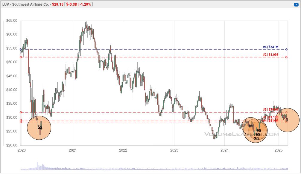
The first thing I notice is that all of LUV's biggest dark pool trades all seem to be around the $25-$30 level. #1 is at $29.20 with 13,500,000 shares traded.
Note the recent trades in the summer of 2024 as well. #85 came prior to the August dip and then three came as LUV came out of the August drop. There was a #20 in there as well that was exactly 5M shares.
It's critical to point out here that although we know when these trades happened and for how much, we have no idea what the trader's position was before or after the trade. This could be a big buy from a trader expecting price to rise. It could also be a short seller covering a short thinking that price is going up. On the flip side, this could be a new short trade or someone closing out a long trade.
I look at these as "lines in the sand". If price climbs over $29.20 on volume, then that's a good sign that someone went long on LUV. If price falls below $29.20, comes back to test it, then falls again, then I begin to think that it was a bearish trade.
What's on the stock chart?
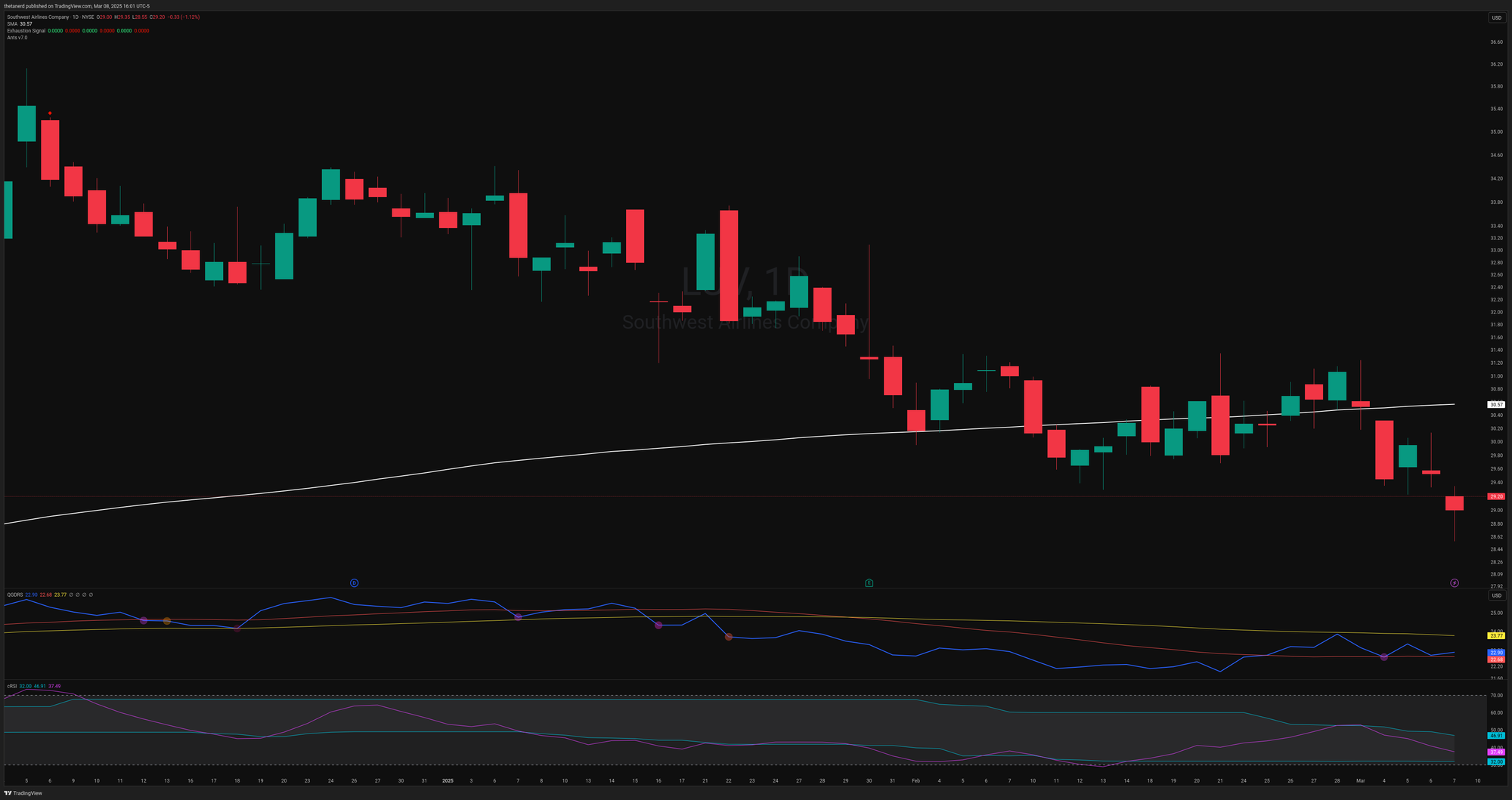
LUV recently dipped below the 30W moving average (white line) and that's typically a bearish signal for me. The entire market seems to have moved under this moving average already, so I'll throw that measure out for now.
The indicator below the candlesticks is a relative strength chart that measures LUV's price moves relative to the SPX index. Note that Friday's price action (furthest candlestick to the right) was actually higher in relative strength to SPX than the previous day where the price was higher. This tells me that LUV has some short term strength, albeit small, against SPX and it's worth watching. Friday's close was right on $29.20 where the dark pool trade happened.
The indicator at the bottom is a smoothed relative strength index (RSI) and it shows that price action is fairly weak right now. That's pretty common for most stocks in the market right now.
VONG #2
ETFs are tricky with volume since they usually get some big moves around the end of the week, end of the month, or on big options expiration dates. However, Friday's trade on VONG was a little different.
It was a dark pool trade of about 4.5M shares at $97.54, but this one was done as a sweep. Sweeps suggest that someone was in a hurry to move shares, but they also wanted to move them quietly. Typically, sweeps are pretty small, but this one was $442M. That's a big sweep.
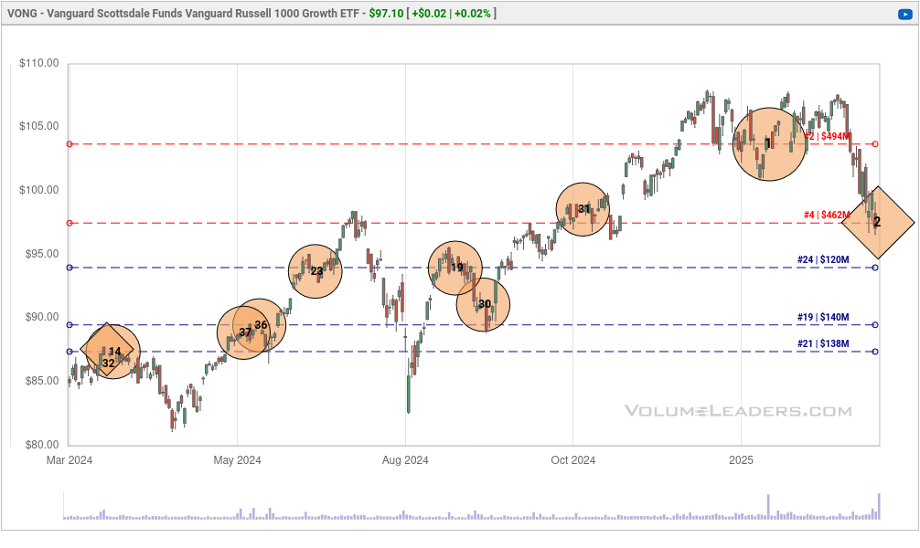
Since we don't know which direction the trader was leaning on this trade, we have to use our context clues to make some guesses about probabilities. I start by looking for other trades of a similar size to guess whether this is an "in and out" trade. These are ones where a trader goes in on a big trade and then exits shortly after.
The #1 trade at the tops in January 2025 was just over 4.6M shares and this recent #2 was just over 4.5M. Those are pretty close. There are a couple of theories here:
- A trader went short at the highs and covered their short in a hurry based on something they saw on Friday. This seems plausible since the market has dropped plenty and we might be due for a relief rally.
- A trader went short at the highs and added to their short with an equal amount Friday. This seems less plausible because they would be "shorting the hole" at a support level for VONG.
- A trader went long at the highs and gave up Friday. I find this one really doubtful since it's clear that firms cut their long holdings early at the tops and that led to this run down.
Is there anything else on the chart that helps us make a better guess?
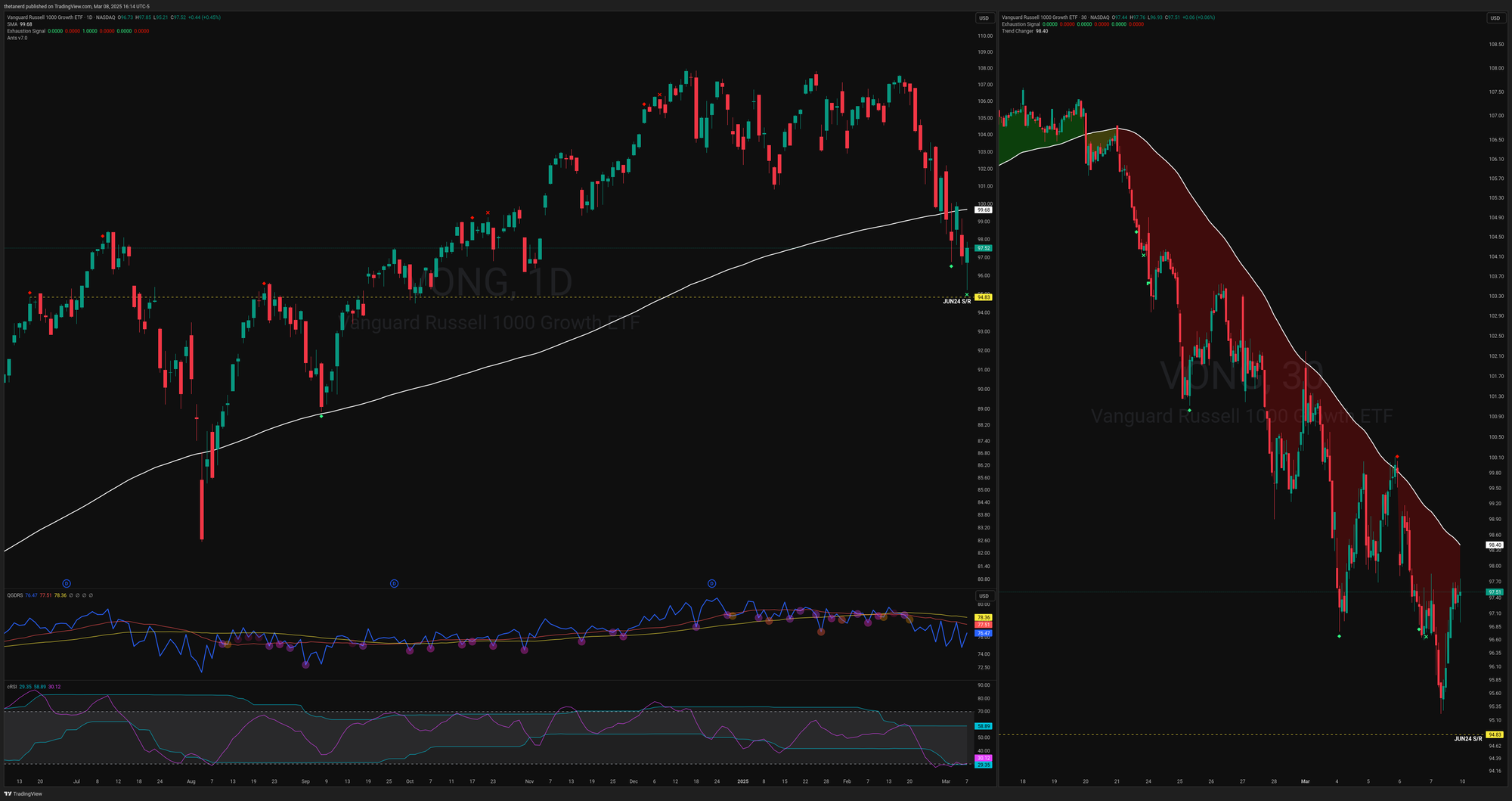
The chart above shows a daily VONG chart on the left and a 30 minute chart on the right with a five day moving average. I've made a dashed yellow line at a potential support point from the June 2024 high. The daily chart shows that the rally failed prior to the August low and then price tested it later in August from below. Then price went over the level, tested it again from the top, and then ran higher.
On the right, the five day moving average is in a very bearish slope with lots of drops and runs back to the moving average. However, we're nearing the support level again from June 2024. If we're going to get a bounce, even a short term bounce, the probabilities are higher that it would happen here around $94.83 than anywhere else nearby. The RSI is buried in the bottom of the range and outside the channel.
This give me more confidence that this was likely someone with a short position who covered (bought back) their position in a hurry on Friday to avoid a potential loss from a relief rally at a big support level.
Either way, setting an alert on this #2 trade level at $97.54 is a good idea. Watch how price reacts and you might be able to make a good trade!
SPHY #3
The SPDR Portfolio High Yield Bond ETF tracks "junk bonds" in the market. These are typically riskier bonds that are labeled as "below investment grade." These bonds have higher yields (dividends in stock parlance) because you expose yourself to more risk (higher chance of default) when you invest in them.
You might be saying: "Okay, bonds are so boring so why should I care?" The bond market often moves before the stock market, for one thing. In addition, there are far less rules in bond markets than stock markets and news travels much more quickly (and sometimes, more quietly).
When the price of junk bonds drops, that's usually a sign that traders don't want to hold higher risk bonds and they prefer something safer. Economic instability and inflation put strains on businesses and that puts a strain on these high yield bonds. You wouldn't want to be a bond holder in a company that is struggling to make money.
Let's check the chart:
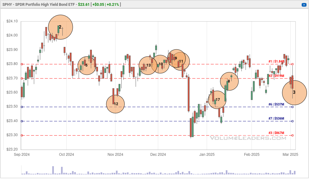
This chart starts just after the August 2024 dip and you can see how price came down a bit after a failed rally and traders pulled back from riskier bonds in December. Traders came back to risk in January, then sold off, then came back again, and then sold off. #3 came in at 7.9M shares, $186M, and a relative size of 45x. The price was $23.60.
What does the chart tell us?
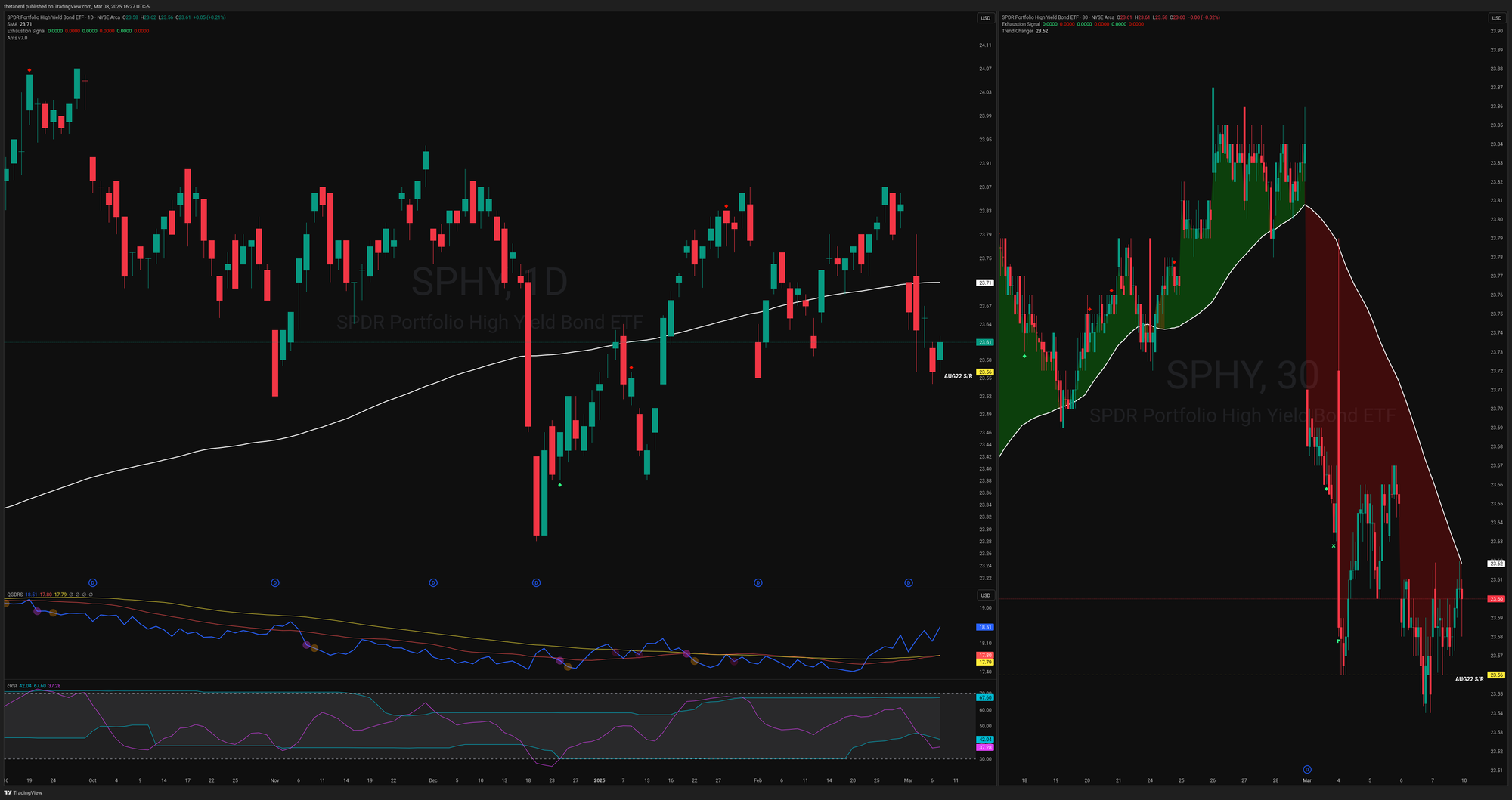
SPHY certainly took a bearish move as evidenced by the five day moving average on the 30 minute chart on the right. However, it caught a small bounce on a support level dating back to August of 2022. Relative strength to SPX made a hard turn on February 21st and it's making new relative strength highs over the past few weeks.
This #3 trade is about the same size as the two previous ranked trades (#17 and #8), and they're all around the same price. This could be someone who went long here before and is going long again, or these trades could be totally unrelated.
Either way, I'm marking $23.60 on my charts and setting an alert. I'm interested to see how prices move on Monday from this area.
Wrapping up
Remember that although the broader market might be headed down, there are always opportunities out there for good trades. Plenty of stocks made new 52-week and all time highs this week! Another good choice might be going to cash as we wait for this choppiness and volatility to wind down.
Good luck to everyone this week. 🍀
Discussion