Point and figure chart-o-rama for September 2nd

Let's break out some point and figure charts to identify strength in the markets. ❌ ⭕

Happy Labor Day to my readers in the USA! 🇺🇸
I'll be going through some point and figure charts today for the larger indexes to see where the market is showing some strength and where investors might be pulling back some capital.
All investments come with significant risks, including the loss of all capital. Please do your own research before investing, and never risk more than you are willing to lose. I hold no certifications or registrations with any financial entity.
Let's dig into some charts!
Some changes to my point and figure charts
I recently finished reading The Definitive Guide to Point and Figure by Jeremy Du Plessis and it's an excellent book that goes into more detail than other books I've read. It's full of example charts and scenarios that help to explain the concepts. It also has a great explanation of calculating price objectives (targets) based on horizontal and vertical measurements.
One of this recommendations is to start with a 3 box reversal chart with 1% box scaling. I have typically used traditional box scaling in the past and I'm getting accustomed to this change. Du Plessis suggests starting with a 1% box size and then shifting to 0.5% for shorter term trades to see if the same patterns appear there. Longer term trades could use the 2% box size and compare the patterns there, too.
All of the charts in this post will use a 3 box reversal with 1% box scaling unless otherwise specified. 🤓
S&P 500
The SPY point and figure chart is building a base recently from about $518 through the highs around $563. We had the massive run up to the highs, then SPY fell back during August, and rallied right back up to make a double top:
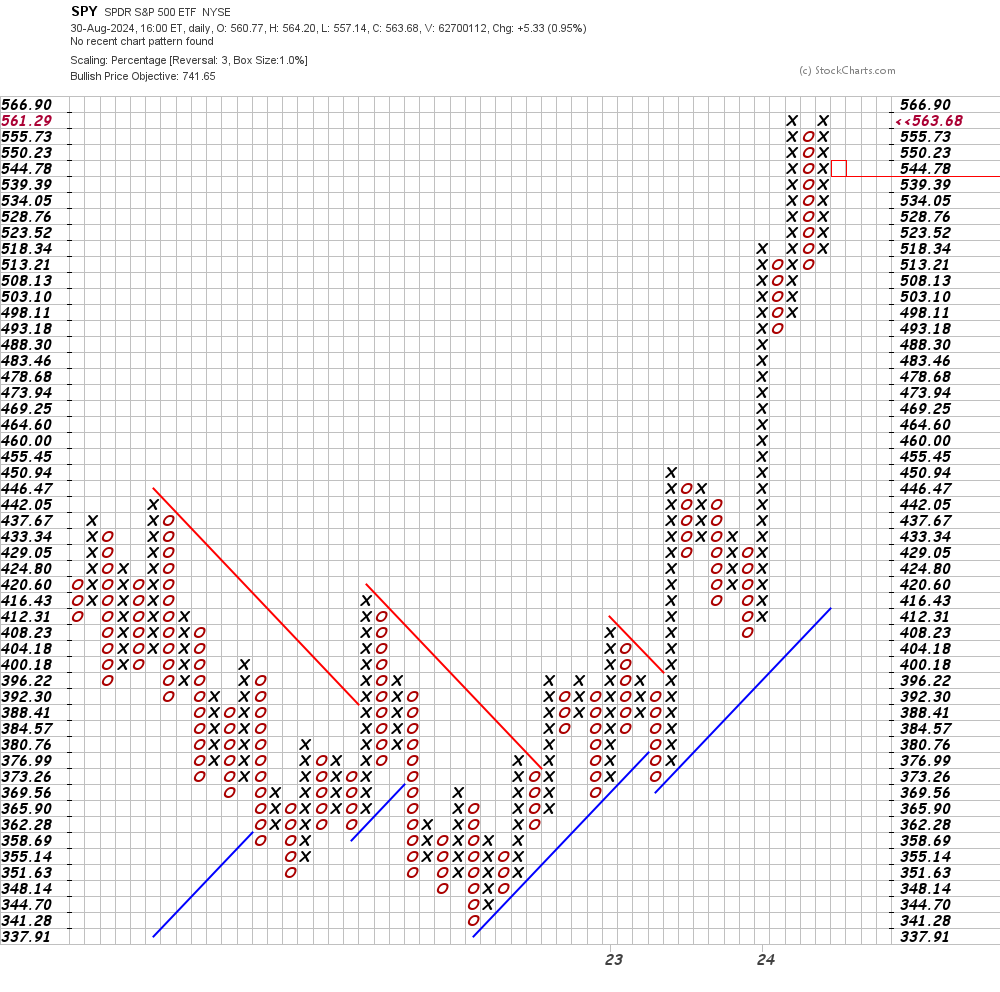
As a reminder, double tops on point and figure charts are a bullish signal, but they are not the best signals for entering into a trade immediately. We want to see some type of other confirmation, such as a break out above the double top or a broken trend line happening at the same time. Based on a 1% box size, a push above $566.90 would give us a bullish double top breakout. A fall under $539.39 would start a new column of Os headed down.
We can shift to a shorter term view with a 0.5% box size to see which patterns we see there:
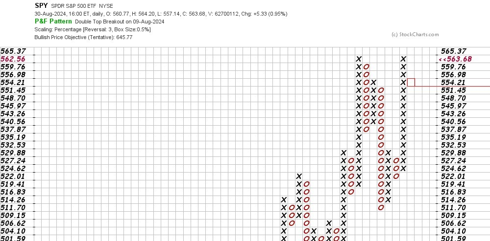
I cropped the bottom of this chart to focus on the most recent patterns. It looks like SPY was beginning to build a triangle down from the highs when everything broke down in August. SPY rallied back up (the column of Xs starting at $514.26) but only stacked up 7 Xs before falling back again. A quick 3 box reversal appeared and then SPY started heading up once more.
The double top signal appeared at $529.88 and then broke out at $532.53. We're now back to the top of the range once more.
Let's slice the S&P 500 a few different ways and examine the differences. The next three charts are OEX (S&P 100), SPYV (value stocks), and SPYG (growth stocks):
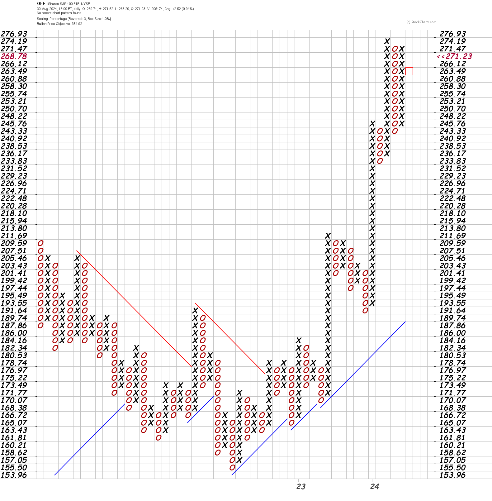
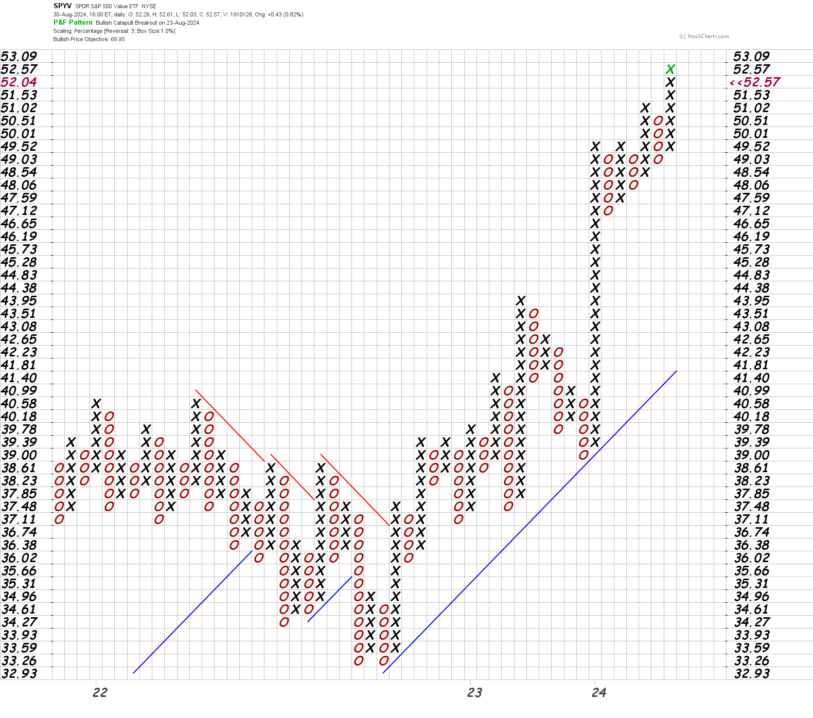
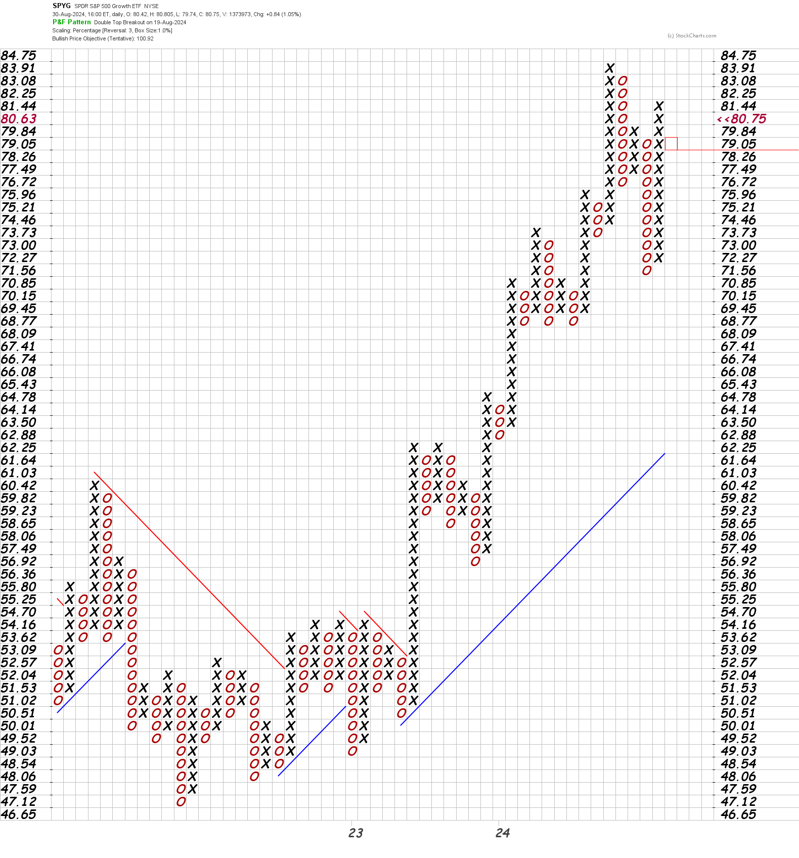
OEF, SPYV, SPYG
OEF has the largest 100 companies in the S&P 500 and the chart looks much like SPY's chart. However, note that the recent rally has not yet reached the high of the previous rally. That suggests that the larges companies in the S&P 500 are losing momentum.
SPYV has an ascending pattern and needs a new bullish trend line underneath the current pattern. It had a triple top breakout at $49.52, then retraced down, and finally ran back up through an ascending double top breakout (more bullish). The SPYV chart looks incredibly bullish to me right now.
On the other hand, SPYG is struggling to regain its strength as it's unable to reach its original highs from July. As a reminder, we can always compare SPYV and SPYG with a relative chart to see which is stronger:
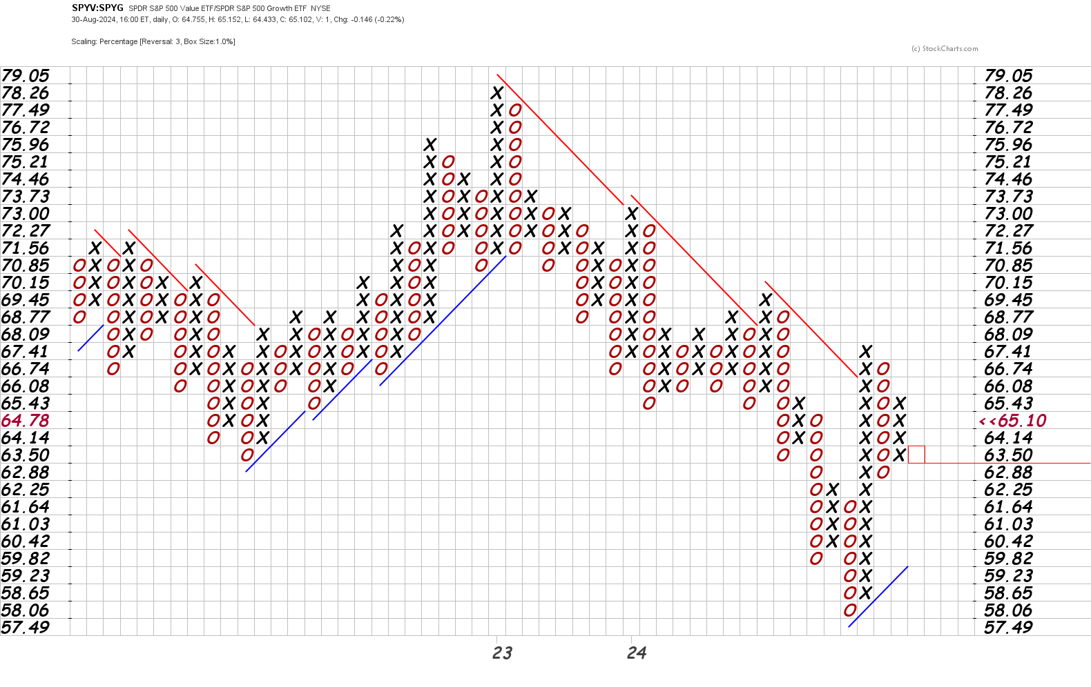
I love these relative point and figure charts because you can catch pivots much more easily. Look at the highs in the center of the chart. You can see where the sentiment from 2022 (where value stocks were in high demand) shifted in 2023. SPYV weakened and SPYG gained strength. However, this ran into some problems recently as SPYV first broke the downward bearish trend line above (red), built a new bullish trend line below (blue) and is now building out a triangle.
Triangles aren't bullish or bearish, but they are a good reminder to keep an eye on the chart. As price action tightens, you're almost guaranteed that price will blast off in one direction or another at some point in the future. We don't know which direction it will go right now, but we know which patterns to look for when it does. 😉
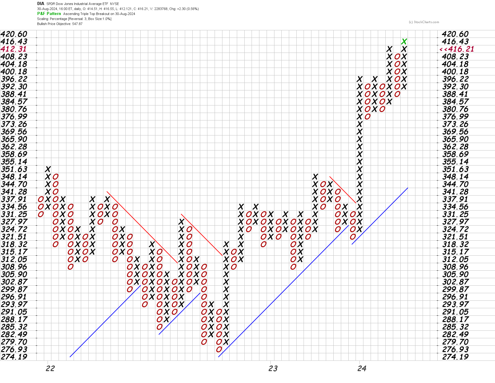
Dow Jones
The Dow hit all time highs last week and the charts look fantastic. Much like SPYV above, DIA built a triple top and then broke out. It retraced a bit, built a double top, and then broke out again! A double top breakout after a previous breakout is called an ascending breakout. More columns involved in a breakout signal greater strength in the price move:
If we compare the strength of DIA to SPY, we see an interesting pattern. Both were wrestling for control through 2022 until something changed and DIA took control and moved higher. DIA got stuck at the highs in late 2022 and lost strength relative to SPY throughout 2023 and 2024.
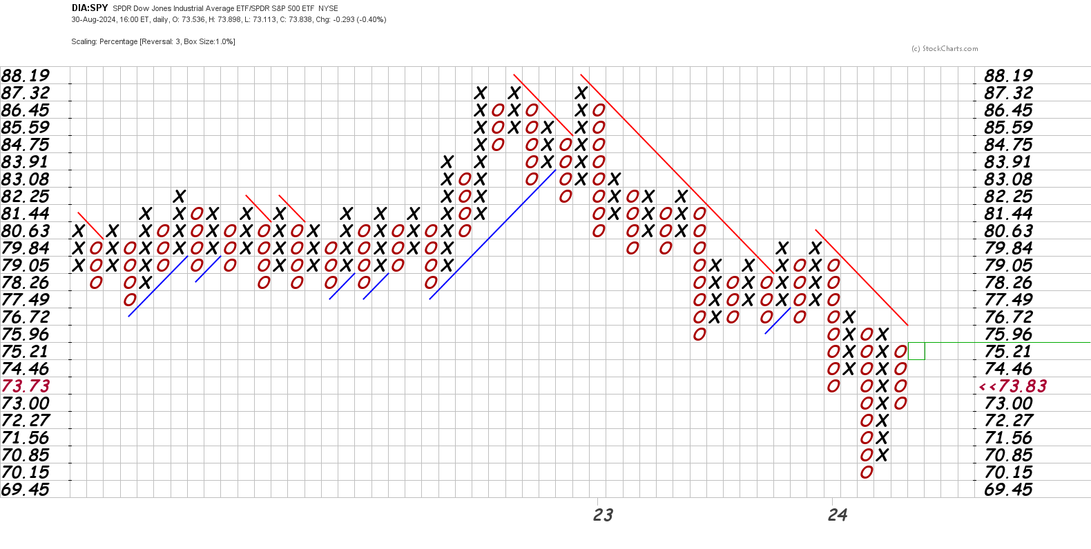
DIA is still working underneath a bearish trend line above and it hasn't done enough to build a bullish trend line below yet. There's nothing in the relationship that shows that the Dow is getting crushed by SPY lately, but it is still running into relative resistance.
Small caps
Lots of people are excited about small caps right now, but they have their own challenges. Some of the largest small cap companies would fit in the defensive investments bucket, such as financials and health care. In addition, small cap indexes contain quite a few companies which are not turning a profit.
I'll use IWM to measure small caps since it's widely traded, but there are other ETF options out there, such as SPSM:
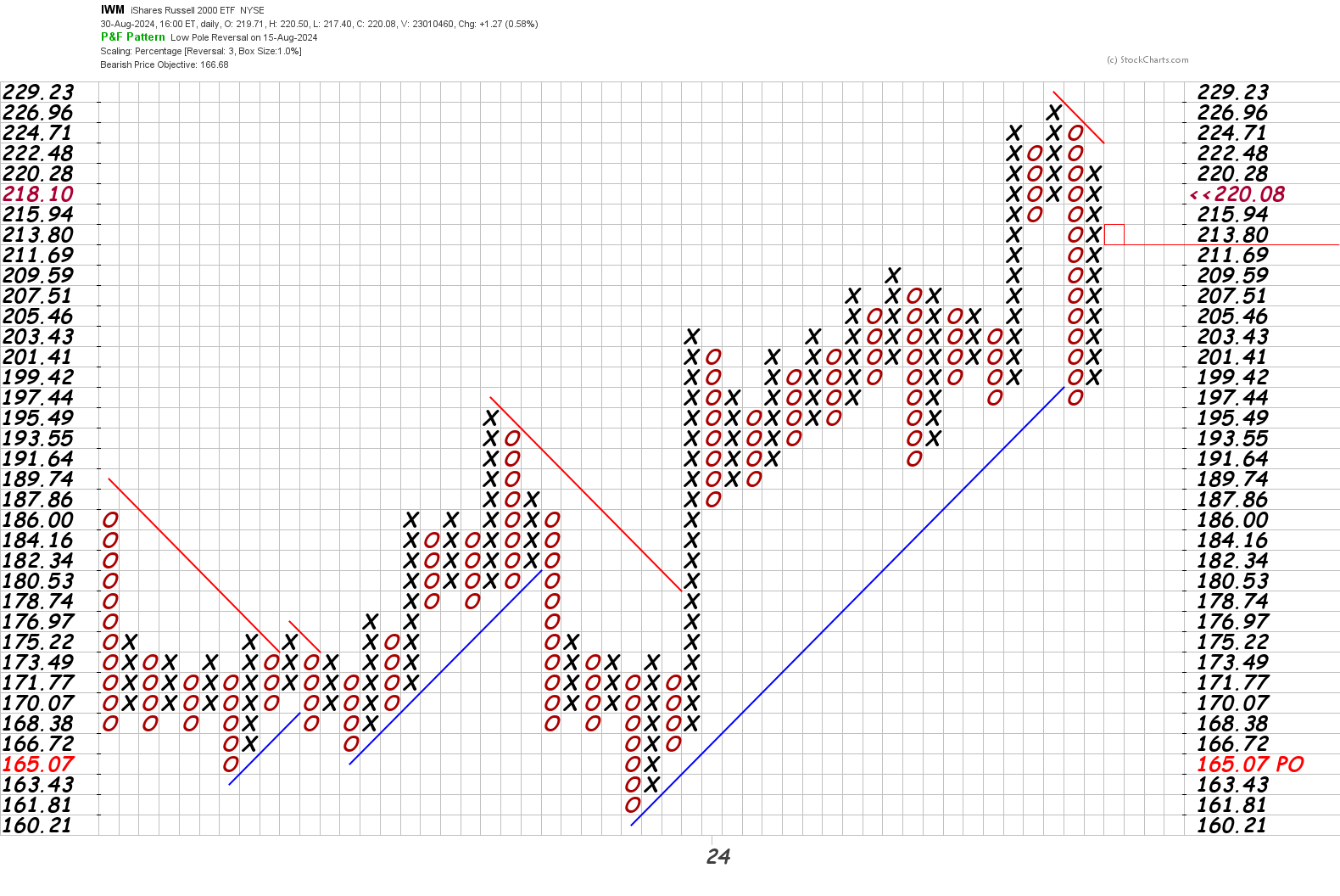
IWM has a tricky chart here because we have a bullish pattern (a long pole reversal) while the most recent larger pattern is a bearish one with a price objective around $165. IWM recently broke its bullish trend line slightly and it's stuck underneath a bearish trend line from above. It recently found support at $197 twice.
Let's compare IWM to SPY to see which is stronger:
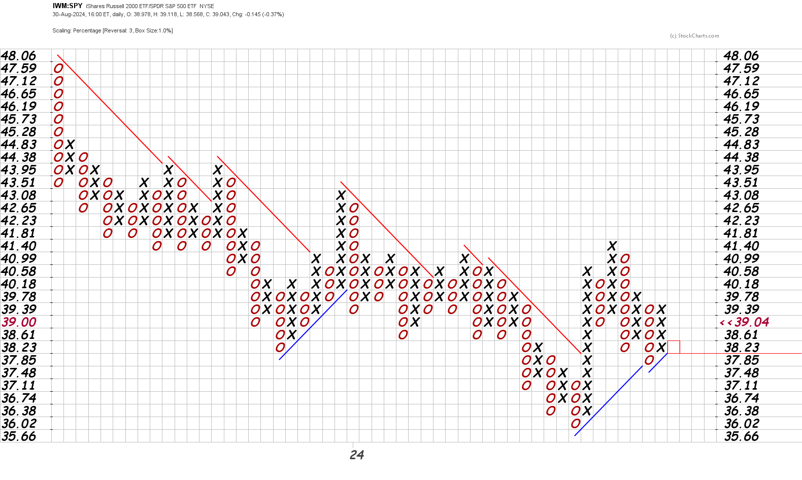
The overall move on this chart shows IWM struggling to regain some strength up until recently in 2024. IWM made a big push through a bearish trendline, then retraced, and then broke up through a double top. However, it retraced down again and eventually broke its bullish trend line.
IWM is more volatile than SPY and I'd expect to see some wilder moves. If it keeps breaking down relative to SPY, we could see a repeat of 2023 and early 2024 where SPY holds much more strength.
Breadth
Let's look at one last chart! This is a relative strength chart of SPY to RSP (the equal weight S&P 500 ETF):
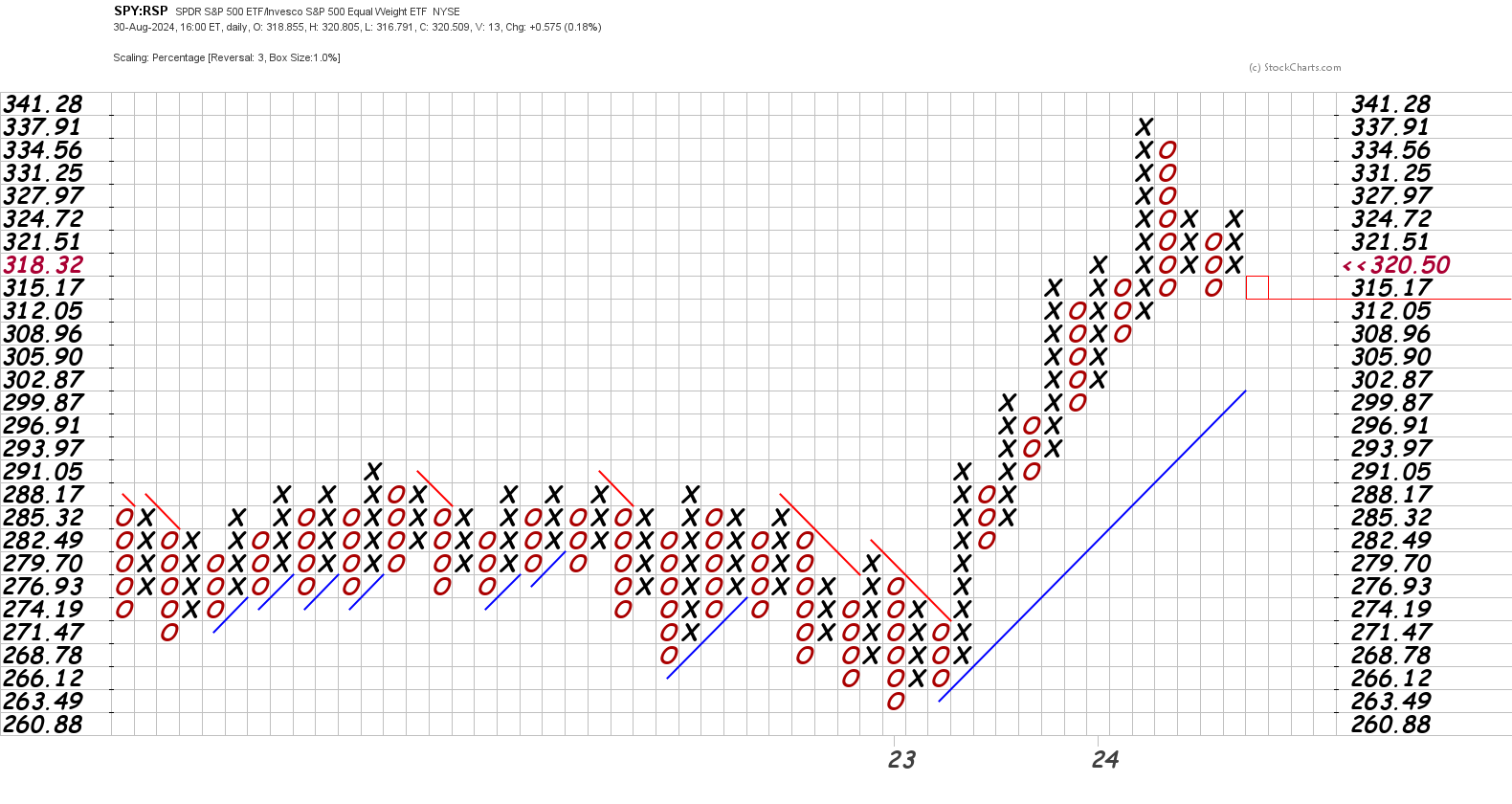
If this chart is moving up, it shows that a market-cap weighted SPY is stronger than an equal weight RSP. That suggests that the largest stocks in the S&P 500 (think the Magnificent 7 and friends) are stronger than the smaller stocks.
SPY blasted off from a long consolidation in 2023 and never looked back. SPY's relative strength reached a high in 2024 and slid back without getting close again. We're looking at a double top in the relationship right now and that's generally bullish. However, SPY's strength fell back to the support zone recently and it's at risk of building another column of Os.
Thesis
There are quite a few things in play:
- The largest companies in the S&P 500 were quite strong all year long but they're really struggling recently.
- IWM is showing some good strength on its own and relative to SPY, but it still has some work to do.
- In isolation, the Dow looks fantastic. SPY is still winning the overall strength battle but keep an eye on that relationship.
- The SPYV/SPYG relationship highlights the battle between value and growth stocks. Growth has the upper hand recently, but the relationship is compressing down into a triangle pattern that will likely explode in one direction or the other.
Lots of macroeconomic factors are confusing investors and traders. That's obvious in the charts. The stocks that led us through 2024 (the mega caps) are on a rocky footing and they left the door open for other contenders to show off their strength. That hasn't happened yet though, and until then, we have to trade the charts in front of us. 😉
Good luck to everyone this week! ☘️
Discussion