Charts & Coffee for December 10

Let's zoom way, way out and examine some longer time frames. 📈

Welcome back! I hope you're having a great weekend. I just finished watching the latest video from Ciovacco Capital and it's chock full of good reminders about long term trends and what's changing in the market structure:
Here are my main takeaways:
- The 60/40 bond split portfolio was painful since 2020 and there are various other signals that point to the old safe havens as less beneficial now.
- TLT is down 40% off the August high
- It's really important to remember to zoom out and look at the long term trends to see the health of the market.
This last part is tremendously difficult for me. I get caught up in the short to medium term trends and often lose sight of what's happening on the longer trend. Draw downs and corrections are just part of life but if they don't signal a change in the long term trend, there's not much to worry about.
All investments come with significant risks, including the loss of all capital. Please do your own research before investing, and never risk more than you are willing to lose. I hold no certifications or registrations with any financial entity.
Let's get a look at some charts.
SPX
First off, the SPX monthly chart is wild if you've focused more heavily on daily and intra-day moves. SPX fell through the moving average envelope (settings: 50 month, 6.8% width) during the beginning of COVID and then returned to test the edge of the envelope in late 2022. We're just now starting to make a move off the envelope once more after a brief touch recently.
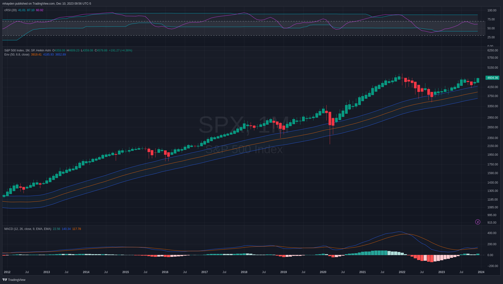
There was a bullish cross on the MACD back in July and a slight touch a few months later. The RSI suggests we're running right in the middle of a channel with room to climb higher.
Shifting over to a weekly view, we fell through the MA envelope in 2022 but rallied back above it and bounced off the 50 week moving average very recently. That's quite a bullish sign.
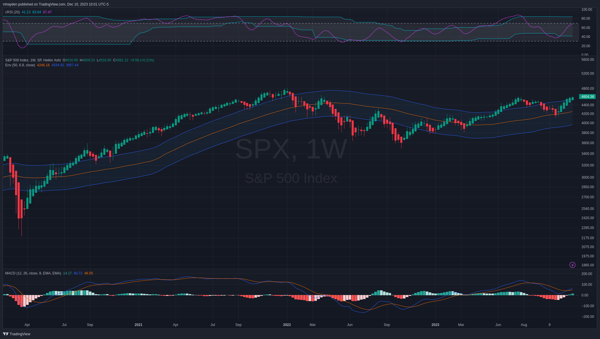
Weekly MACD looks good and although the RSI looks like it's running a bit hot on the raw scale, it still has some room to climb.
Finally, let's get a look at the daily. The daily has bounced within the moving average envelope since the COVID drop. RSI is running quite hot and the MACD looks quite indecisive. We may be looking at a consolidation or a draw down coming soon as part of a longer term bullish trend.
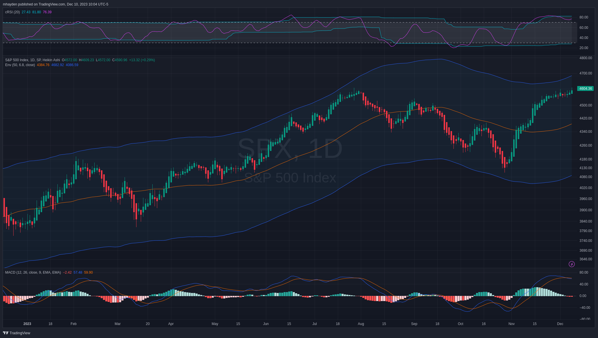
However, note that the recent consolidation has given SPX a little more breathing room at the top of the envelope on the chart. A longer consolidation could build up more room to rise.
AMD
I'm reminding myself about the longer term trends more often lately. How does this apply to something like AMD? The monthly envelope is a bit tighter for AMD here but it has looked good since it tested the envelope in 2022.
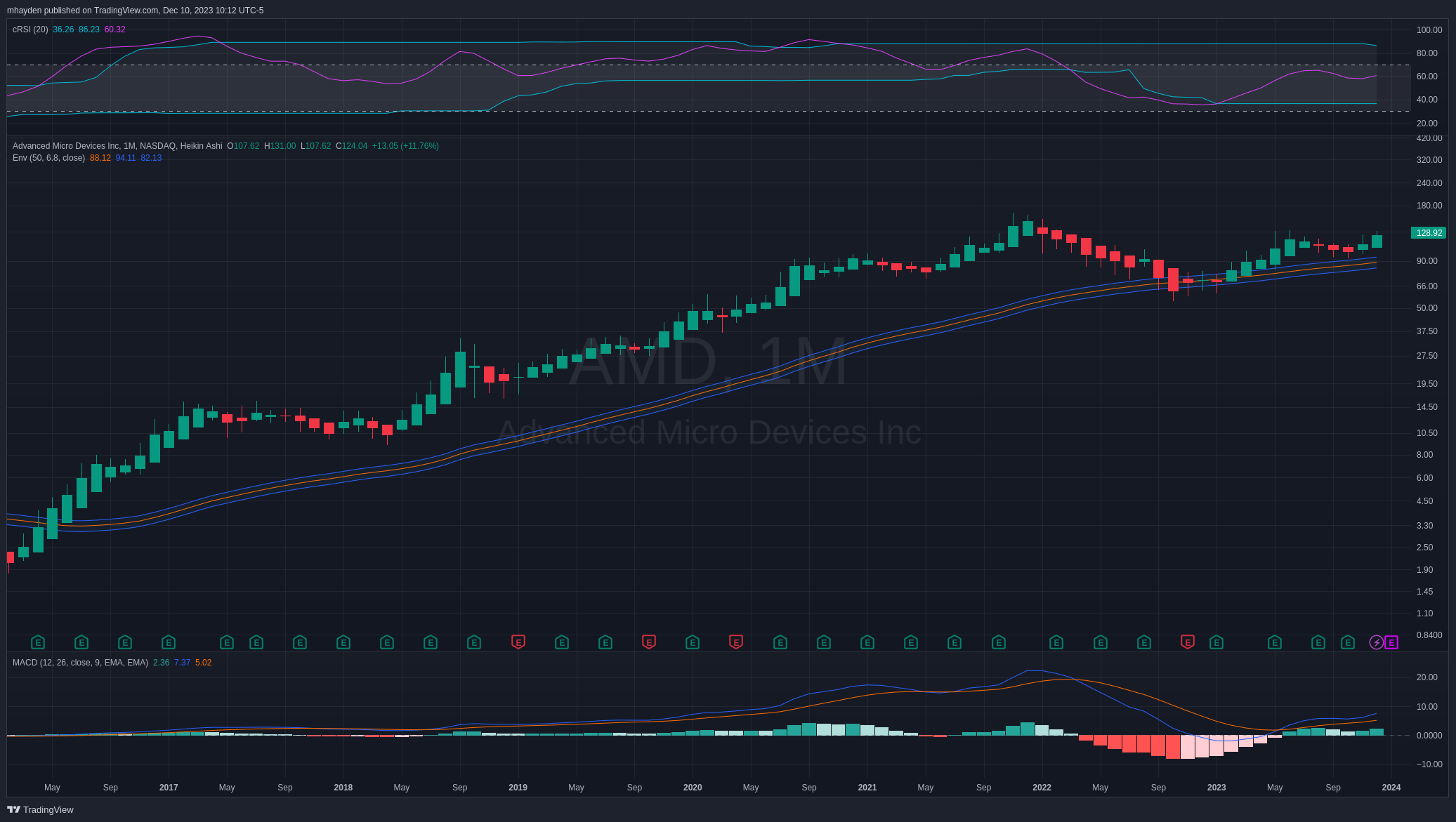
RSI is in the middle of the channel and the MACD has really turned a corner since May. The MACD looked like it might make a bearish cross recently but it turned higher once more.
TSLA
TSLA loves being the oddball of most of my trading research each week and the monthly chart is no exception. It ran off from the envelope as COVID started and then returned to revisit the 50-month envelope in early 2023. This is a much more volatile stock than most and you can see that the early 2023 candles really broke through the envelope aggressively before bouncing back.
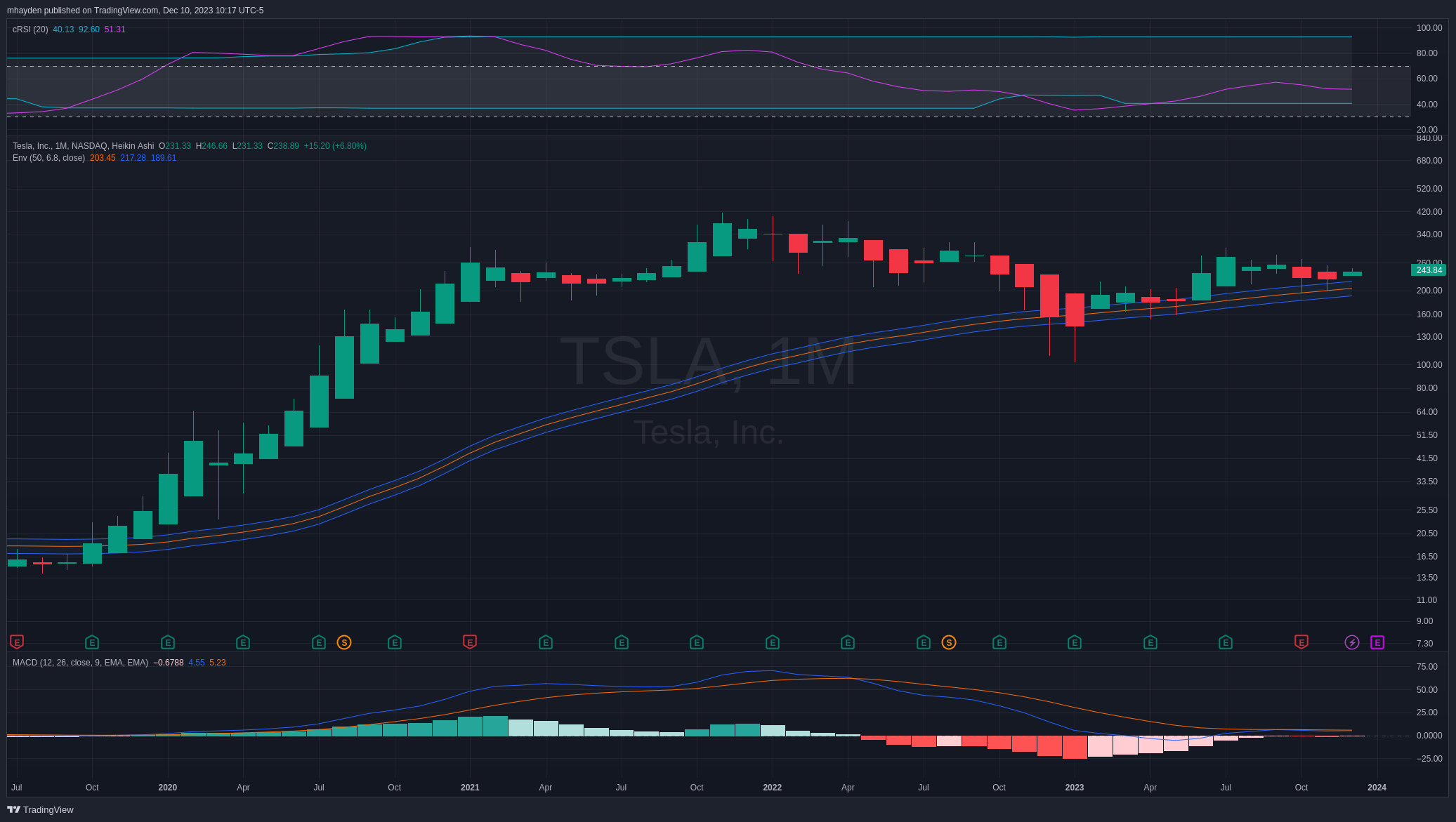
RSI suggests there's room to run higher. The MACD looks a little indecisive here but it's still positive for now.
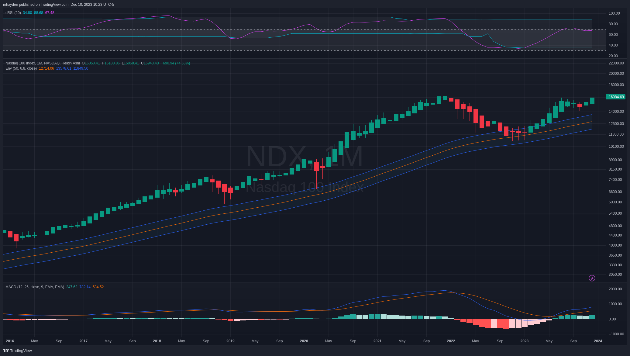
NDX
The NASDAQ 100 definitely has more volatility than SPX but it's following the envelope as well. It dipped inside that envelope earlier in 2023 but then bounced out and is trying to lift off recently. RSI is a little warmer here relative to SPX but there's still room to move up in the channel. The MACD is suggesting a bullish outlook with the fast line well above the slow line and all of it is above zero.
Thesis
Inflation still looms in the picture, but the market doesn't seem extremely concerned about it on the long term. On a shorter time frame, the market is looking overbought and we likely need a consolidation or a small draw down before we can move higher. I still have some investments in short term treasuries and I plan to use that draw down to shift a higher percentage into equities.
Selling options has been tougher lately because there's a smaller selection of equities and indexes out there with enough implied volatility to make it worthwhile. I still enjoy selling puts because it gives me a chance to buy into stocks when those draw downs do occur. Instead of closely watching the market to plan a trade, I can simply say "If that stock falls to $100 by expiration, I'll buy it."
I'm surrounded by a lot of smart and friendly traders as part of Theta Gang and we're constantly learning new ways to improve our skills in the market. You might enjoy tuning in for updates from some other people:
- Joonie's daily stream on Twitch is a great way to get started as he's running a small $5K account on Robinhood where he sells spreads.
- Another member of the group started Meh Stock Analysis with a recent update about TLT
One of the best things I've done recently is to ensure I'm reading balanced analysis from people who are bullish and bearish in the market. It's extremely easy to have a bearish view from watching TV news or reading market-centric publications like the Wall Street Journal. Stories about the market being great don't garner that much attention (and ad revenue), but scary bearish analysis draws a lot of eyeballs.
Good luck to all of you this week. 🍀
Discussion