Let's talk about moving averages

Nearly every chart in my arsenal has a moving average applied to it. What makes moving averages useful and what are the right ways to use them?

As the market gyrates around for a myriad of reasons, I thought it might be a good time for stepping back and getting an understanding of moving averages. I've been sharing a lot of posts on Mastodon lately and one of the questions I received was around moving averages.
If you're an experience chartist, you might want to skim this or skip it altogether. For those of you who are new to technical analysis and using moving averages, this is the post for you!
All investments come with significant risks, including the loss of all capital. Please do your own research before investing, and never risk more than you are willing to lose. I hold no certifications or registrations with any financial entity.
Let's get right into it.
What are moving averages?
A moving average consists of two measurements: a time frame and a count you want to use for your line. For example, you can pick 200 days, 10 weeks, 40 months, or whatever suits your time frame. There are lots of common time frames, especially 20, 50, and 200 day moving averages, but you can choose whatever you like.
You can also apply weights to a moving average, such as exponential moving averages, weighted moving averages, and volume weighted moving averages. All of these start with a time frame and count, but they put more weight into certain parts of the calculation. This posts focuses on simple moving averages with no weighting, but everything in this post can be used with those special moving averages as well.
Let's examine a 50 day moving average. This means adding up the closing price of the stock (or other asset) over the last 50 days and then dividing by 50. When the next day ends, you add that closing price to the list and drop the oldest one. Repeat the calculation. On the third day, add on the third day's closing price and drop the oldest day's closing price. Repeat the calculation.
Over time, if the stock price is moving higher, the average moves up with it. The moving average always lags the stock price since it's an average of prices over many days.
How does it look on a chart?
Here's a very basic daily chart of AMD with a 50 day moving average applied. Note how the moving average (blue line) lags on upwards movements and downward movements.
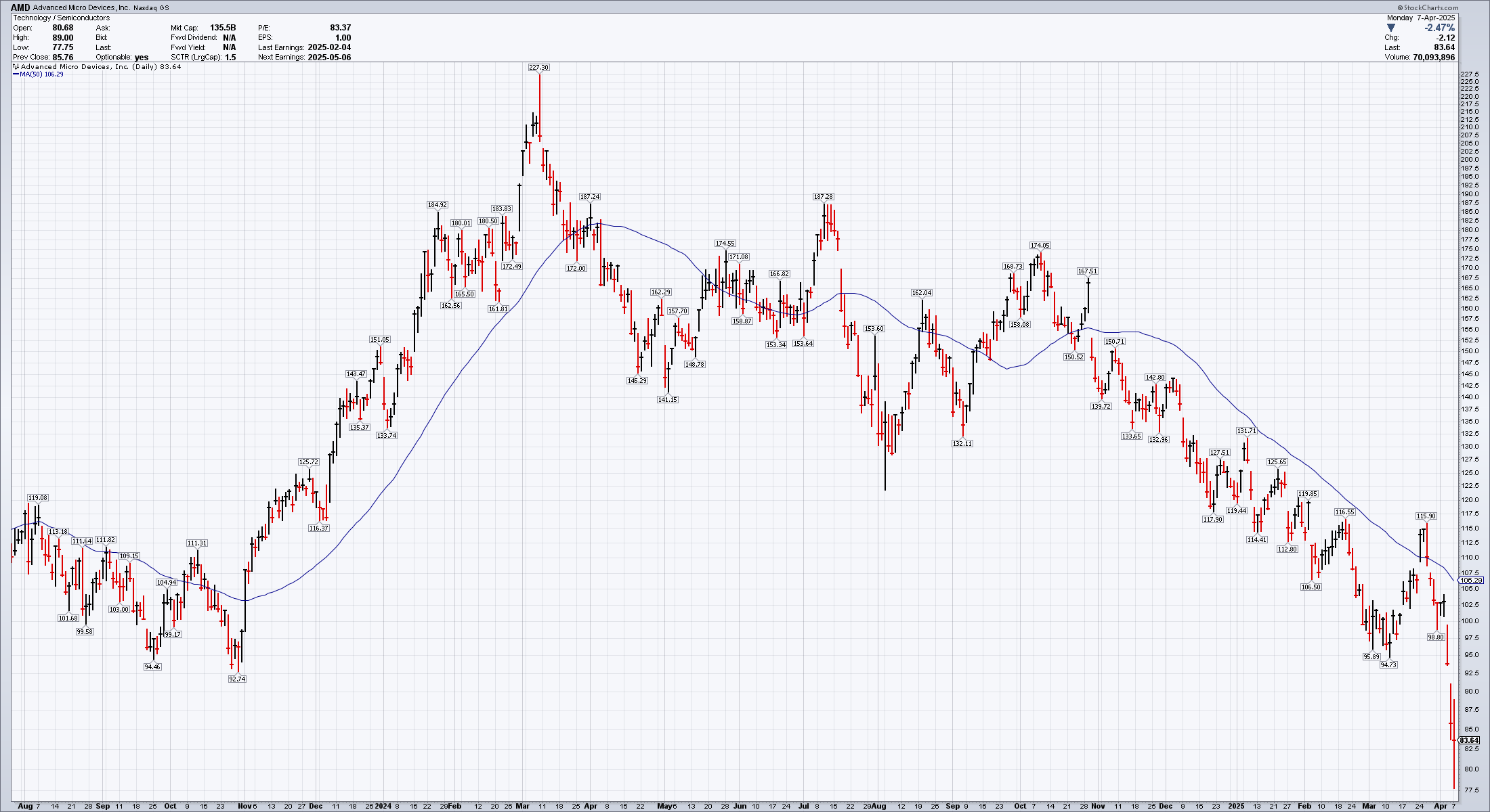
AMD's price movements on the left side of the chart are wild, but the moving average is much more calm. This smoothed movement makes it much easier to track a trend when there's a lot of whipsaw back and forth.
If you choose a longer period for a moving average, the path is smoothed out much more aggressively and it lags the price movement even more. Here's a 200 day moving average applied to the same chart:
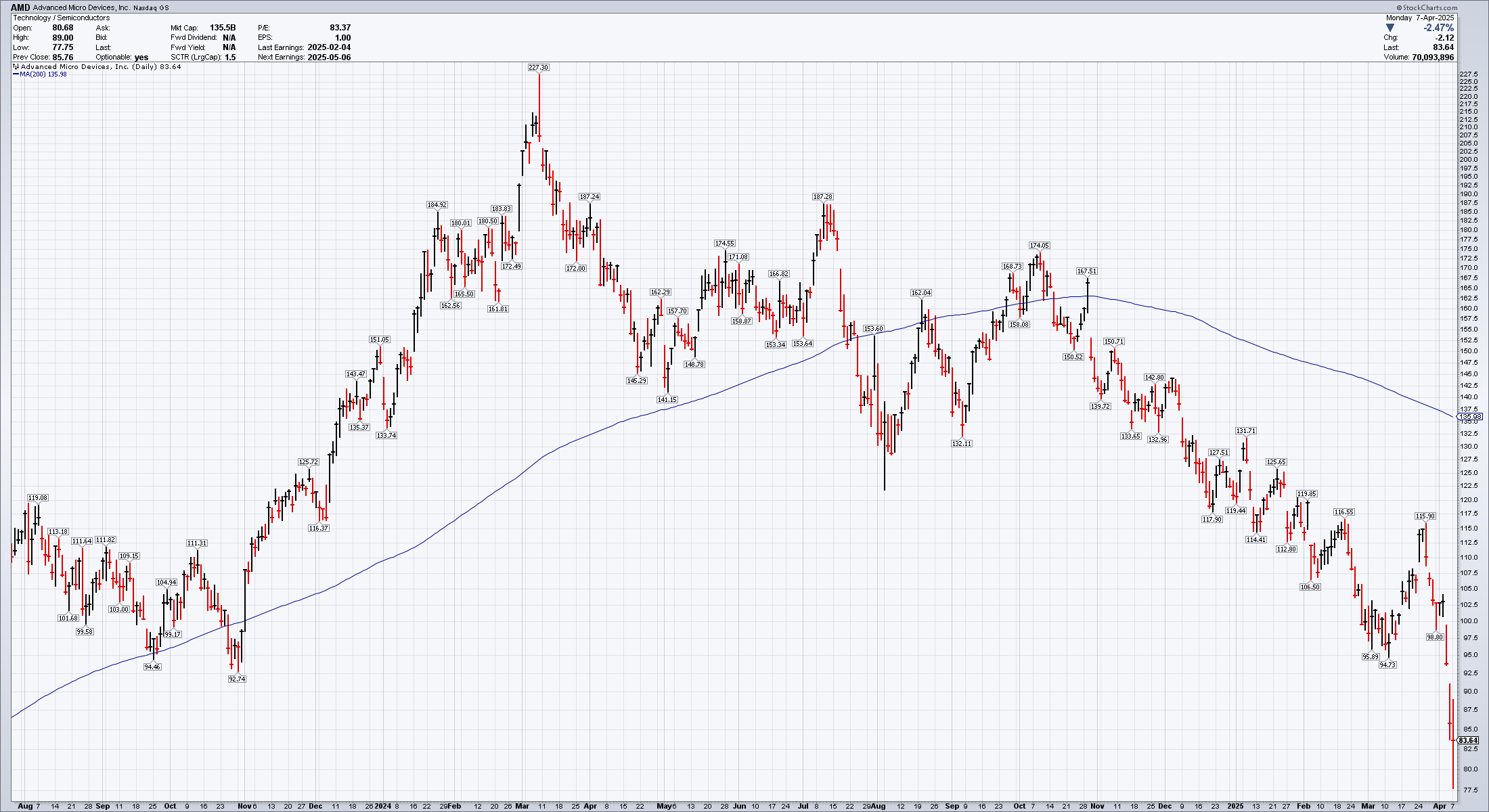
Note how the moving average can get very far away from the price moves at times. These longer term moving averages are helpful for traders with longer time frames.
Interesting patterns also appear if you add more than one moving average to the chart. Here's one with the 50 and 200 day moving averages added:
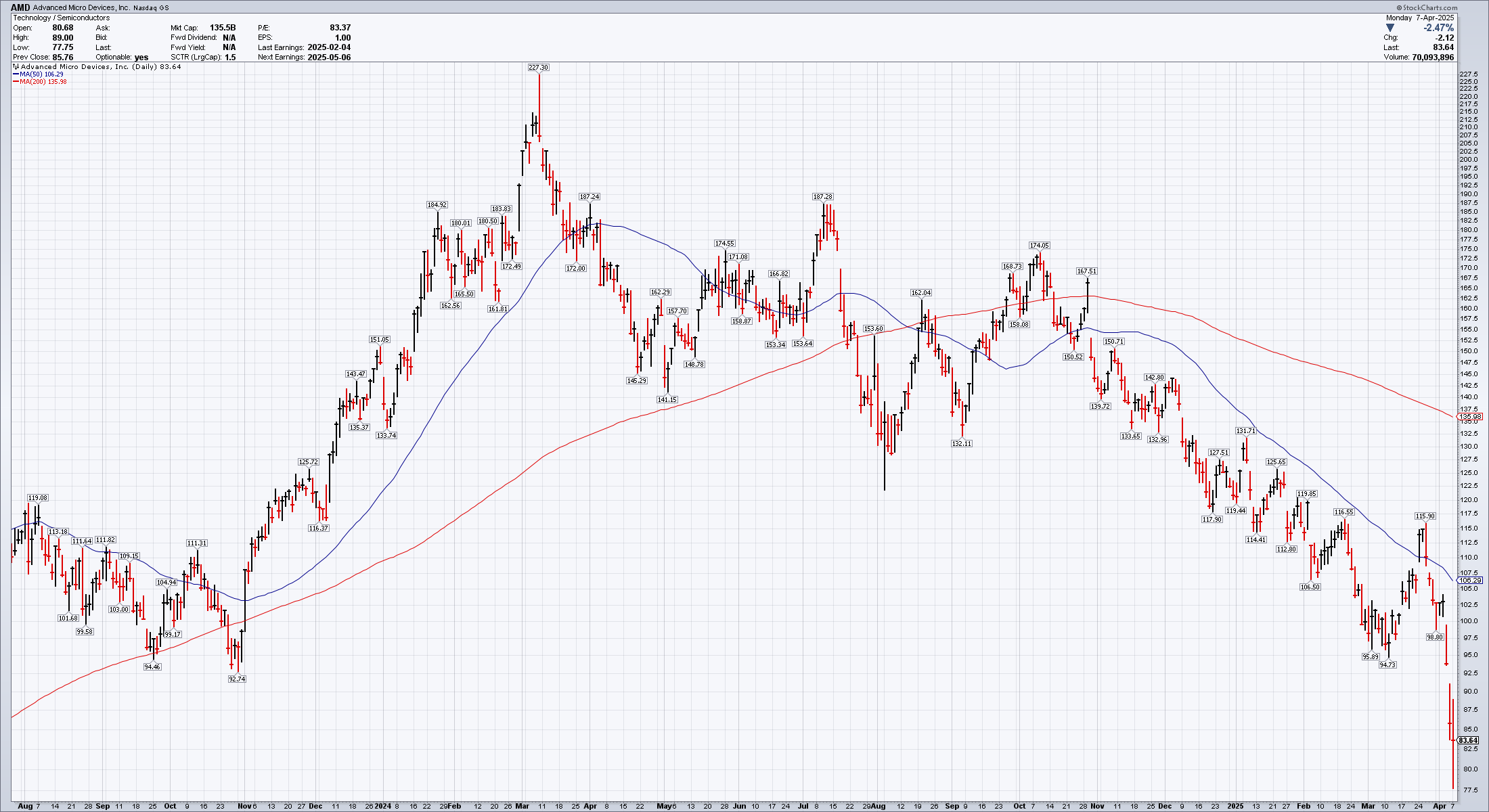
Try not to get carried away, though, as adding too many of these can lead to confusion and analysis paralysis. That's when you have so much data to analyze that you're unable to make a trading decision. 😉
How to use moving averages
Moving averages are a great way to smooth price movement and highlight areas where something interesting has happened, or might happen soon. Going back to the AMD example, I've annotated a few spots where interesting things happened:
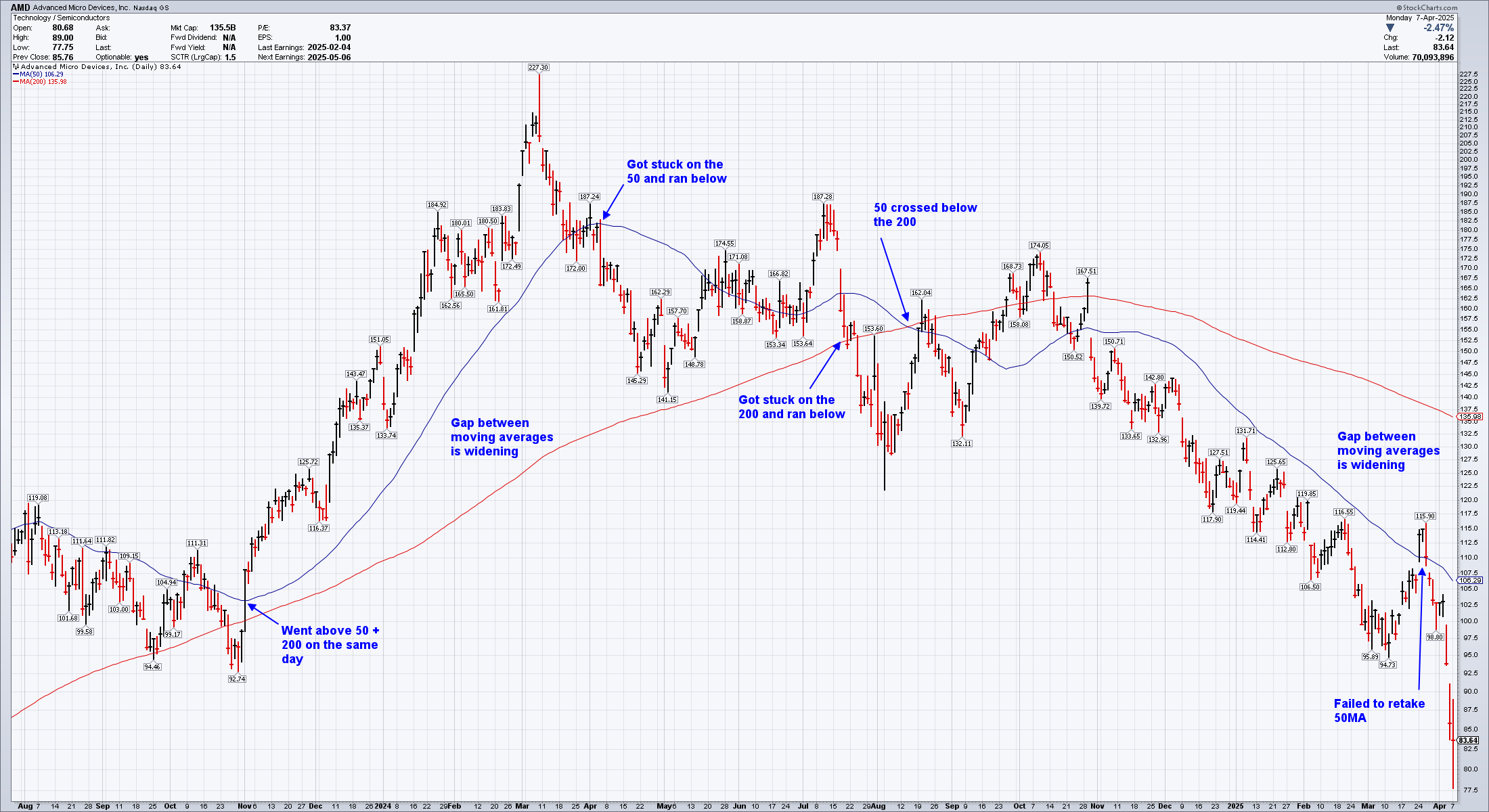
Starting on the left, there was a day in October where AMD crossed both moving averages on the same day. That's a tremendously bullish sign, especially if volume confirms the move. After that, the gap between the moving averages widened for months. That's another bullish sign as it shows that recent price movement is extremely strong.
Then something happened in March. Price ran back to the 50 and got stuck there before falling below with a very abrupt red day in April. The moving averages started narrowing after that. Price got stuck on the 200 in July before falling below. These make a long string of bad signs for bullish traders.
Finally, in August, AMD made another run upwards as the 50MA crossed below the 200MA. Whenever you see a shorter term moving average cross below a longer term one, this is called a death cross and it's a strong sign that the price action is likely headed lower. When the opposite occurs (shorter term MA crosses above the longer term MA), it's called a golden cross. That's a bullish signal.
Scan right to October and the 50MA tries to reconnect with the 200MA and fails. December started a period where the moving averages widened again in a bearish manner. Price made a few runs at the 50MA and finally crossed it in March. That rally failed back below the line and we're well below the 50MA today.
Savvy traders may note that there were lots of support and resistance breaks along the way that showed where AMD might be headed, but moving averages make it much easier to get an idea of the trend after a quick glance.
Moving average slope can also give you some warning signs all by itself. When a moving average switches from rising to flat, or flat to rising, that signals a potential change in trend. Here's an example on a META weekly chart with a 50 week moving average:
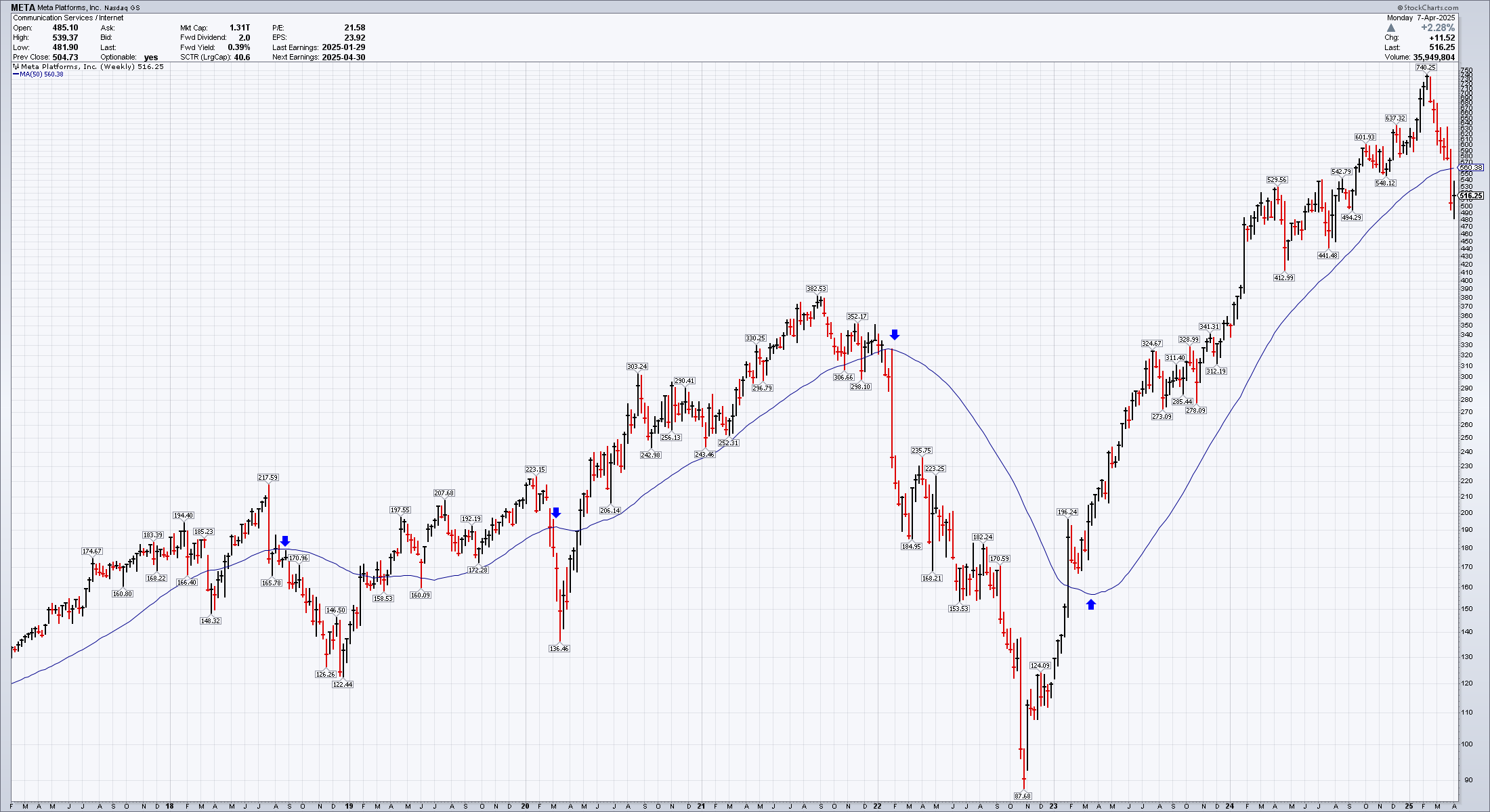
I've placed arrows in each spot where the moving average became flat. The first two highlighted spots where price stalled before moving higher, but the two last ones marked significant changes of character in the stock price movements.
Moving averages can also form a base for setting up trading rules. For example, many traders won't touch a stock that is below its 200 day moving average. It's a quick way of screening out any stocks which aren't moving strongly in a bullish manner.
How NOT to use moving averages
As I mentioned earlier, use moving averages as a sensor or warning system for your trades rather than a line in the sand or stop loss point. Price will often whipsaw around these levels as traders who are all looking at the same moving averages make decisions on what they want to do. If you do use them as a stop loss point, I recommend moving your stop a bit below the moving average line to leave room for some wiggling around near those levels.
Never look at a moving average as a support or resistance level. I've seen so many traders make a trade as price approaches a 200MA claiming "it has to go up here since everyone uses this line." Every trader in the market has a different portfolio, time horizon, and trading goals. I've seen price cut through a moving average like a hot knife through butter more times than I can count.
Here's a recent example with GRMN:
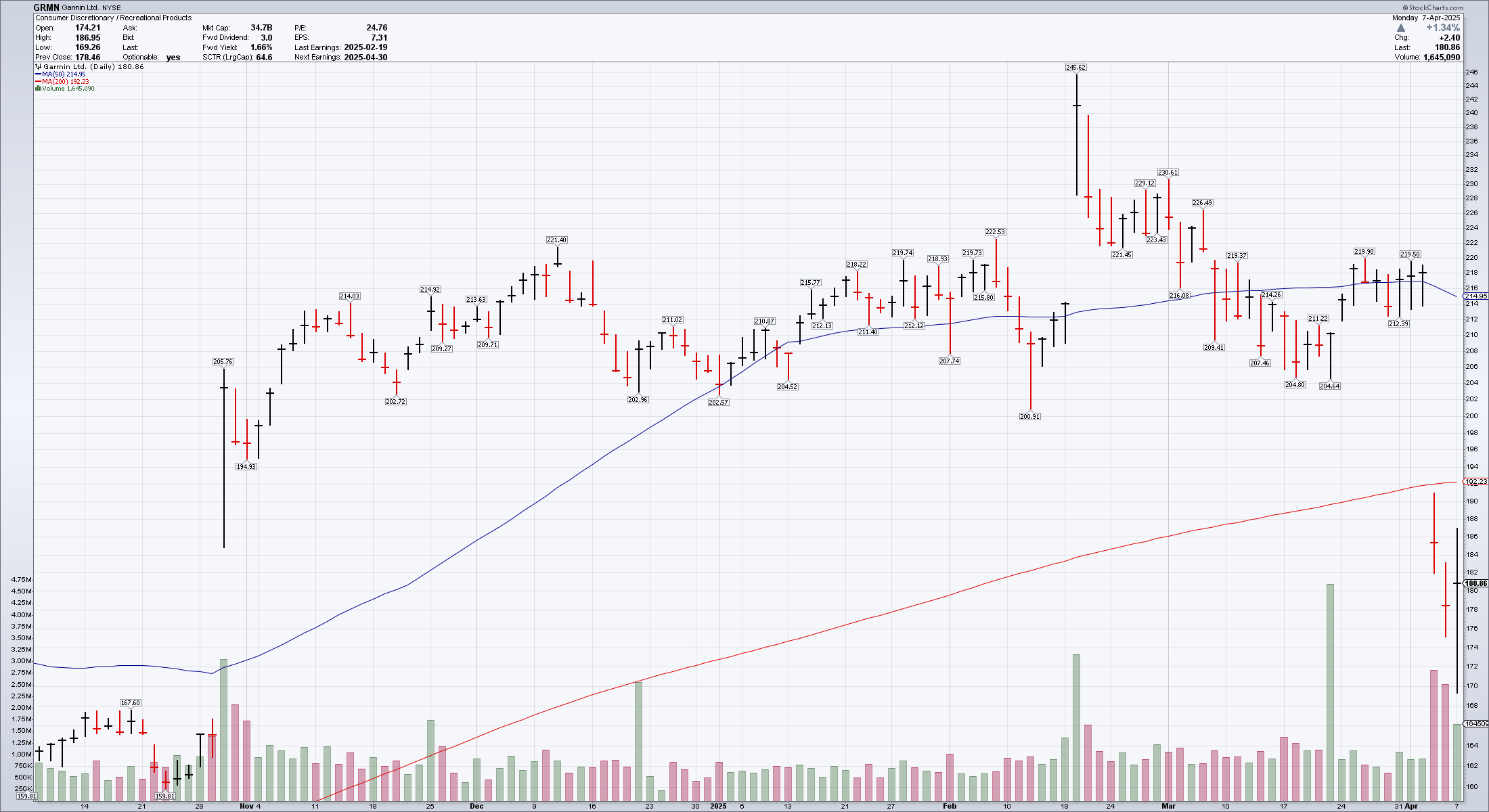
Note how the price gapped down through the 50 and 200 day moving averages in a flash. You might argue that the 50 (blue line) was supportive in some ways, but neither moving average slowed down the abrupt fall from $218 to $180. Also note that the slope of the 200MA barely changed with this massive drop and the 50MA moved only a little.
Summary
Moving averages are great for highlighting changes in trends and trend strength. They are free on almost every charting platform on the planet and you can apply them to any time frame from seconds up to months or years. These lines also allow you to quickly scan charts for those that are in the strongest trends in the direction you care most about.
They're also great for alerts. For example, you could screen for stocks where the 50 crossed over the 200 (golden cross) or vice versa (death cross). You could screen for or alert on stocks where price closed on the opposite side of a moving average from the previous day. These give you hints about where you should focus your attention.
Use caution with these lines, however. Relying on them as support or resistance is a fool's errand. Instead, monitor what price does around these key levels. Did the price cut through the line with an uptick in volume? That tells you that the line breach was noteworthy. Did price try to break through multiple times and couldn't do it? That tells you that many traders think the price has reached an important level.
Good luck this week! 🍀
Discussion