My new found love for point and figure charts

Point and figure charts smooth out price movements and make it easier to spot trends, but they won't replace your candlestick charts.

Happy Saturday! This has been a wild few weeks in the financial markets and I'm on a mission to become a better technical analyst to pick up on market signals more efficiently. This journey led me to point and figure charts recently and I want to share what I've learned with you.
All investments come with significant risks, including the loss of all capital. Please do your own research before investing, and never risk more than you are willing to lose. I hold no certifications or registrations with any financial entity.
Let's get into it!
High level overview
I spotted point and figure charts in my account over on StockCharts when I signed up and my initial thought was: "these charts are weird." And they are! Here's an example of IWM, the Russell 2000 ETF, in a point and figure chart:
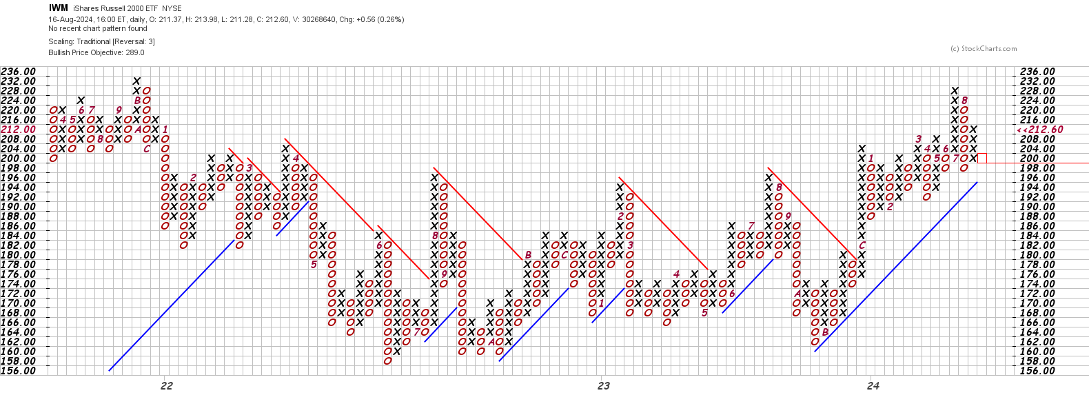
Are we playing tic-tac-toe? 😆
Here's the shortest possible summary about these charts:
- Price is on the Y axis and time is on the X axis, but the time is not linear. Look at how long 2022 is (starting with the 22 in the IWM chart above) and how short 2023 is!
- A line of Xs shows an up trend and a line of Os shows a downtrend. The numbers and letters (A, B, C) denote the months with January as 1 and December as C. (November is B and October is A since it's too difficult to put 10, 11, or 12 in a small box.)
- If the price of a stock makes a higher high in an uptrend (a line of Xs) you make add another X to the column as it passes that price level. If it doesn't make a higher high, but it does make a lower low, you move to the next column and begin a column of Os. This chart has a 3 box reversal, so you'd start with 3 Os in a line.
- The same thing happens in a column of Os when you get a higher high. You go to the next column and begin making Xs (starting with three).
- Every point and figure chart has a bullish or bearish signal active at all times.
If you're confused, that's okay. This is a really unique way of looking at prices. Here are some good resources to learn more starting with the most approachable resources first:
- Bruce Fraser has a great two-part series on YouTube that takes you through the plots step by step and introduces bullish and bearish signals.
- StockCharts' Chart School has an extensive section on point and figure charts with lots of good examples.
- For those who want to go much deeper, it's hard to beat Point and Figure Charting by Thomas Dorsey.
What I like
These charts compress price movements and reduce the overall noise relative to the candlestick charts. With that said, when I spot something on a point and figure chart that looks like a good trade, I venture over to the candlestick chart to check trends, indicators, and candlestick patterns.
The IWM example from the previous section makes it much easier to spot triangle breakouts relative to a candlestick chart. Here's another example of PLTR where the change in the primary trend is incredibly obvious on a point and figure chart:
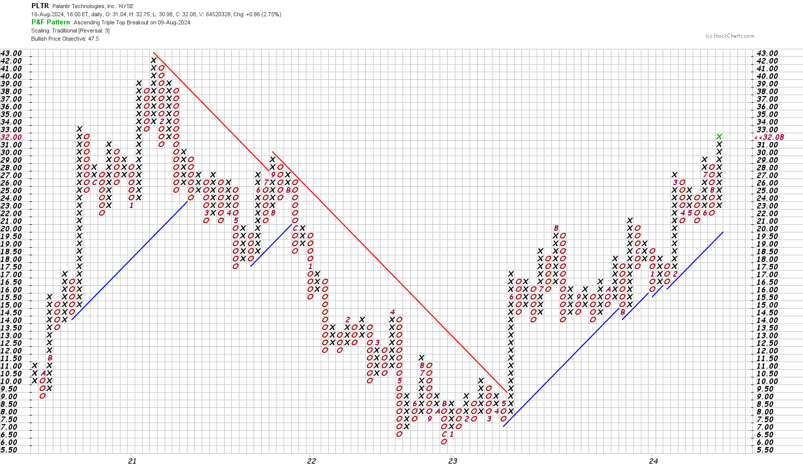
You can tell that something happened in May 2023 (see the 5 on the chart just to the right of the 23 along the X axis).
These charts make it easier to find support and resistance levels because there's less variation in data to content with. Here's a good example of META where you can quickly scan left and pick out key support levels:
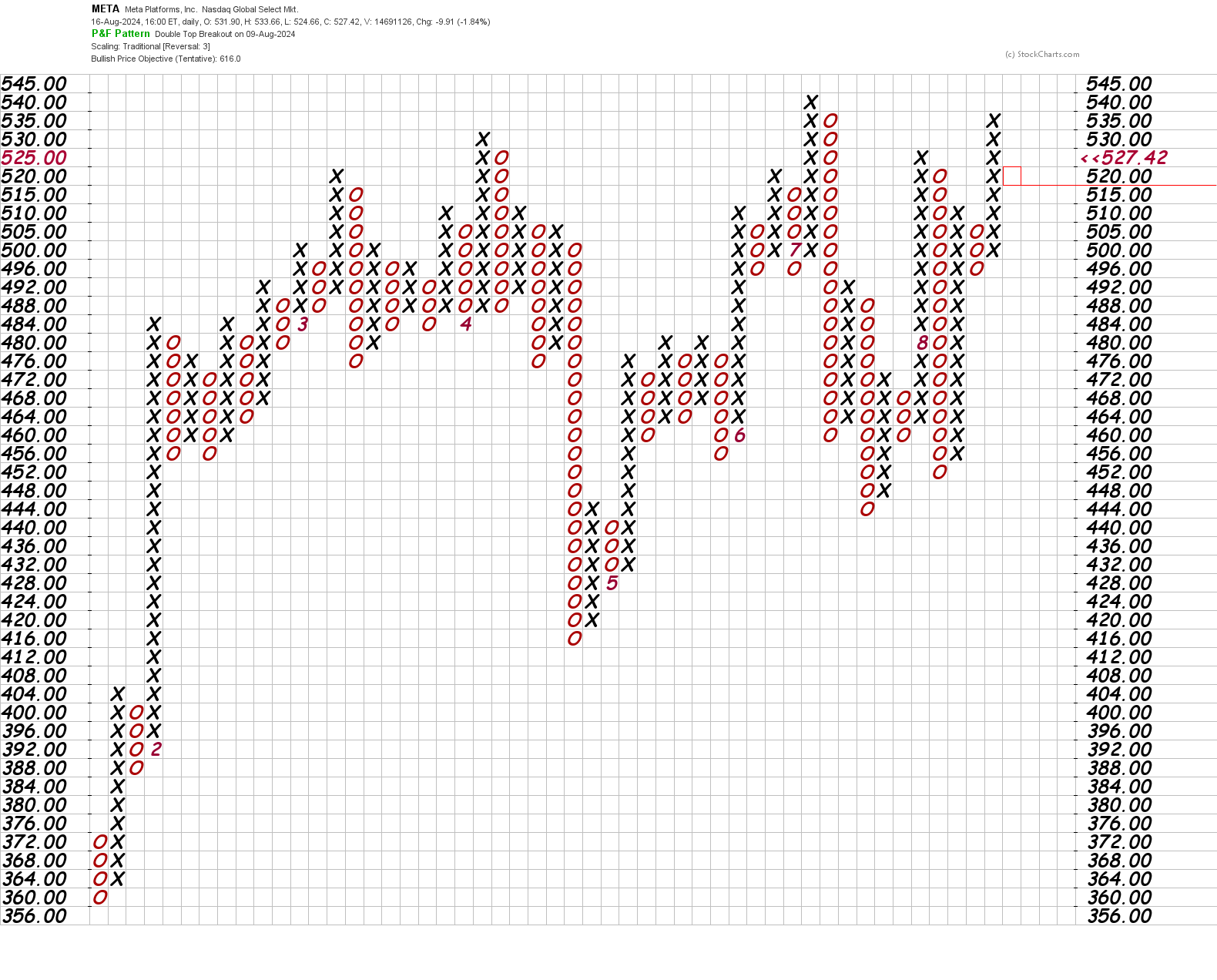
I can quickly see the high at $540. Also, I can see that $496 is a spot where bears have had difficulty pushing price down. $460 is another potential support level to trade.
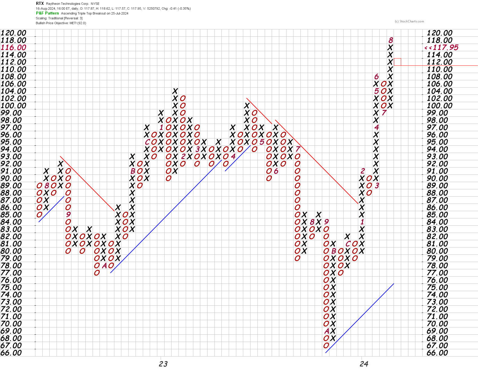
Trend lines are also very easy to draw since they always run at a 45° angle. Here's an example of RTX when it blasted through a trend line at $86 earlier this year and never looked back:
Limitations
It's difficult to see volume associated with these moves, and point and figure charts are notorious for hiding gaps. Here's a recent example of SBUX:
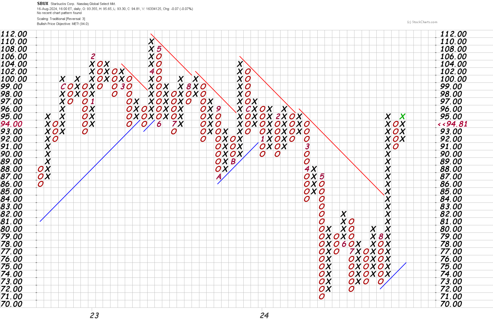
The recent jump in August looks amazing on this chart and you might think "wow, we crushed that trend line!" However, there's more to the story:
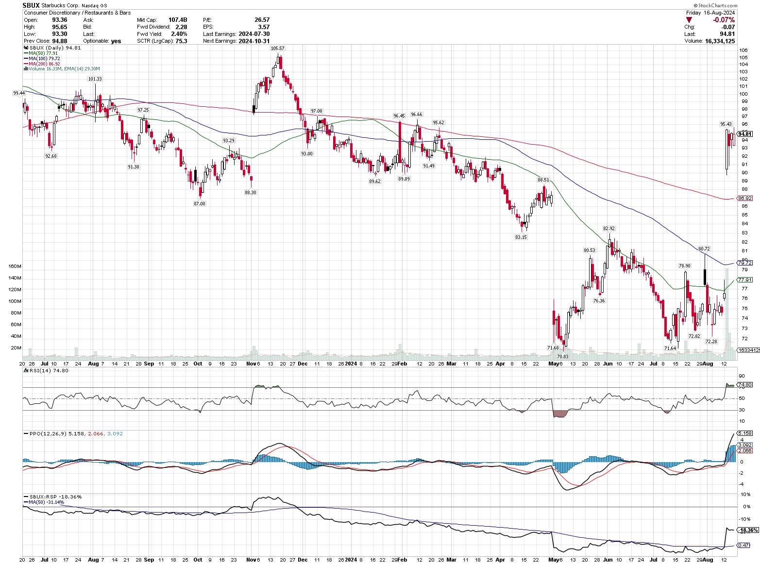
SBUX has a huge gap up after the CEO announcement and you'd miss that if you didn't check the candlestick chart as well. 🤦♂️
Summary
Point and figure charts are another great tool for your technical analysis toolbox. However, they don't replace point and figure charts. I'm using them often right now to screen for breakouts. When I get a list of point and figure breakouts, I roll through them and review the candlestick charts for more detail.
This can be very helpful for those of you who use a weight of the evidence approach before making a trade. I used to think that trades were binary choices. Is the chart bullish? Is it bearish? What do I do?
Instead, I make a list of what I'm seeing on the charts under different time frames and come up with a plan based on all the evidence I can find. Point and figure charts add another good data point to this analysis.
Good luck to all of you this week. 🍀 I'll be writing a lot more about these charts in the future!
Discussion