Revisiting PYPL in September 2024

It's been four months since I looked at PYPL and the consolidation level it was building. What has changed since then? 🤔

My last look at PYPL was back in May and I put it on my watch list after doing some analysis. Something seemed to be changing in the trend back then. Let's revisit the charts and data to see what's changed over the past four months.
All investments come with significant risks, including the loss of all capital. Please do your own research before investing, and never risk more than you are willing to lose. I hold no certifications or registrations with any financial entity.
Time for charts!
Relative strength
Our first chart today is a daily chart with lots of helpful information:
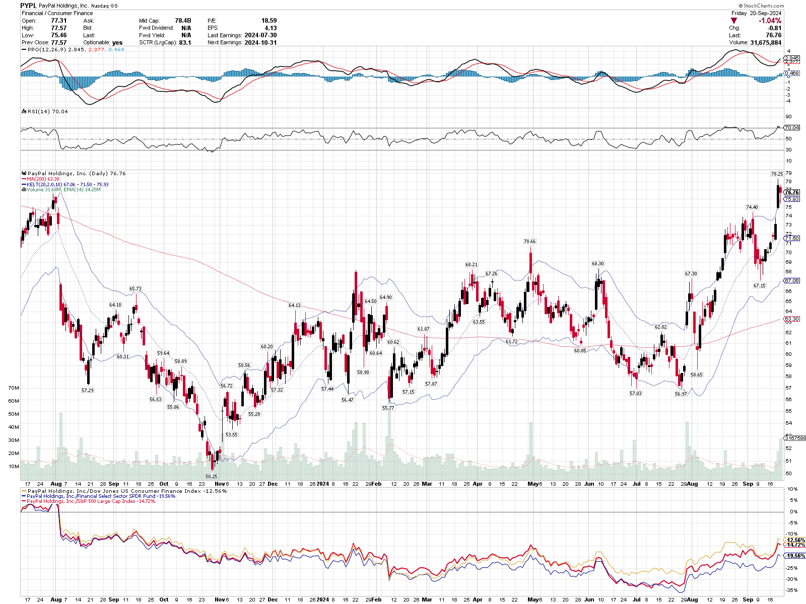
Starting from the top, here's what we have:
- The Percent Price Oscillator (like a MACD, but it uses percent price moves rather than absolute price moves) is above zero and it broke above the signal line. That's a bullish indication.
- RSI is well above 50 and it shows that PYPL is showing off some strength right now. Going above 70 is a good sign of strength, but it can sometimes be a warning for a reversal or consolidation before the next move. PYPL as last at this level in late August.
- On the price chart itself, price is above the 200 day moving average (red line) and that line is tilted upwards. We're a bit outside the 2 ATR (average true range) Keltner channel, but PYPL has rallied outside this range for a while recently.
- At the very bottom, we have a price performance chart of PYPL versus SPY, its S&P 500 sector (XLF), and the Dow Jones US Consumer Finance Index. I like seeing PYPL gaining some strength among its peers since late July and the strength is consistent against all three indexes.
The most recent candlestick is a hanging man and that indicates a potential change in the current trend. It doesn't guarantee it, though. The hanging man candle fits inside the body of the previous candle and that formation is a bearish harami. That suggests bearish price moves are ahead. However, these moves happened during a wild week last week with a big change in interest rates.
We may need to wait a bit to see how this plays out
Longer time frames
Let's zoom out a bit to a weekly chart with some different indicators:
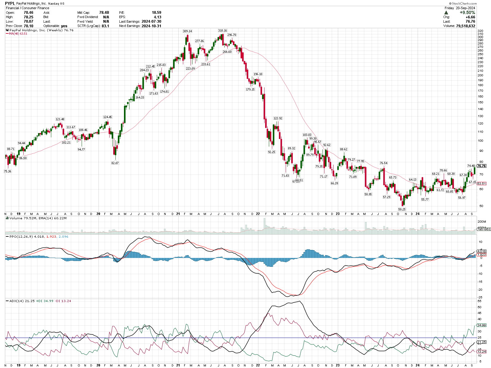
PYPL's meteoric rise during the COVID pandemic was incredible, but the 2022 bear market was rough on PYPL's stock price. Fast forward to today and we have a PPO indicator above the signal line and above zero. The 40 week moving average is below the price and it's trending upwards.
We also have the ADX above 20, but below 25. The ADX indicator gives you an idea of the strength of the current trend. When you look at the main black line, keep this in mind:
- 0-20: No real trend here. Trading is very difficult.
- 20-25: A trend might be forming any day now. Keep your eye on it.
- 25+: A trend has formed. Look for the red/green lines to see which is on top to see the trend's direction. Green above red suggests a bullish trend is underway.
PYPL has bullish price momentum from the PPO indicator and the potential beginning of a new trend from the ADX indicator. This is turning out to be a potentially good setup for a trade!
How about a monthly view?
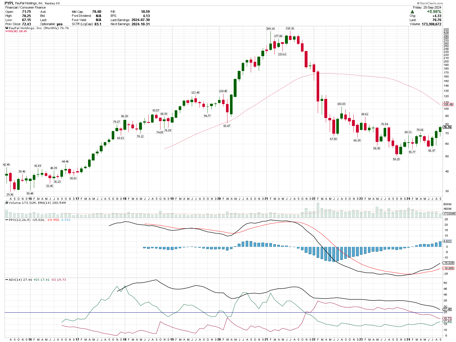
The moving average doesn't look bullish and the ADX suggests we're still in a downtrend. There are promising signs of a turn, though! Note that the PPO has crossed above the signal line and is making its way higher to the zero line. Also, the red/green ADX lines are pointed towards each other and they might cross. That's a very early sign of a trend change going in a bullish direction.
What I'd love to see here is the ADX remain above 25, or at least above 20, along with a cross of the red and green lines. The ADX doesn't need to "bottom out" at a very low number to signal a trend change. That's why we have the red and green lines.
Institutional Volume
Now that we have an idea of what PYPL is doing on the short, medium, and long term time periods, volume from large institutions can give us some clues about important levels and where traders with deep pockets are placing their bets. Volume Leaders offers charts that help a lot with visualizing these bets.
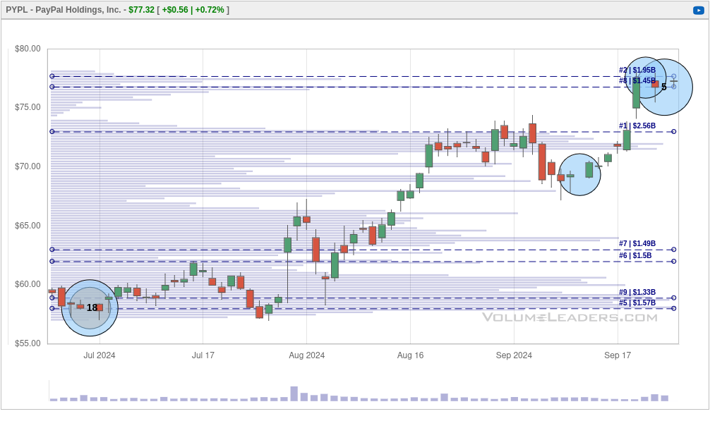
Here's a chart of the past 30 days:
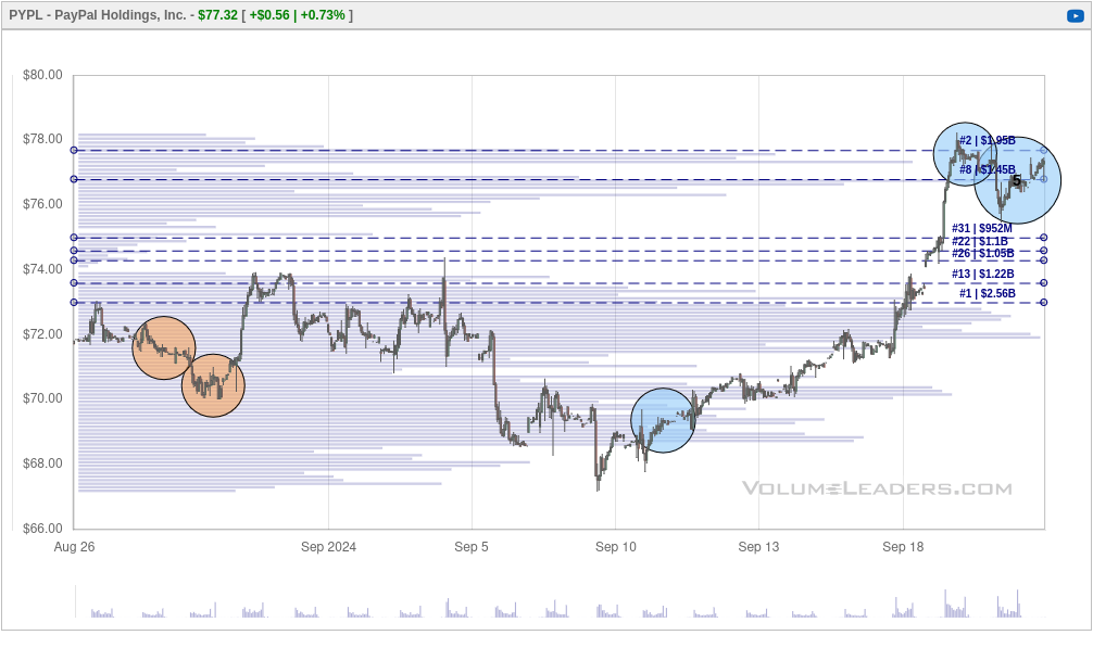
The only ranked trade is a #5 from Friday. However, Friday was a big options expiration date and the S&P 500 index did a re-balance on the same day. Nearly every stock had some massive volume at the end of the day Friday.
If you examine the dashed lines, these show us the big levels where institutions got involved in PYPL trading at some point. The #1 volume level sits around $73. You can look at big volume levels like this in one of two ways:
- Traders with deep pockets made some very large bets here and there's a good chance price will be defended if it reaches this level again (supportive).
- If price wanders down to this level and breaks below it with momentum, remaining long PYPL after that point could lead to serious losses (a stop loss point).
Let's bump the chart to 90 days:
PYPL has some decent volume around $58-$63 and the #1 trade level was briefly resistance in August and price broke above it in September. I'd love to see price venture back to that #1 trade for a retest. That would be a stronger confirmation that we have support at $73.
Let's zoom out to a full year:
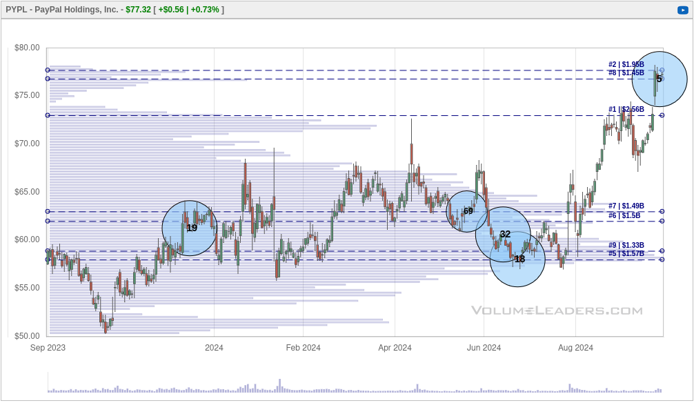
This makes things much more clear. Look at the price consolidation from $55-$65 through most of 2024. Wow! When price gets stuck in a range for this long, eventually it blasts off in one direction or the other. It exploded higher in August.
This is even more clear on the point and figure chart:
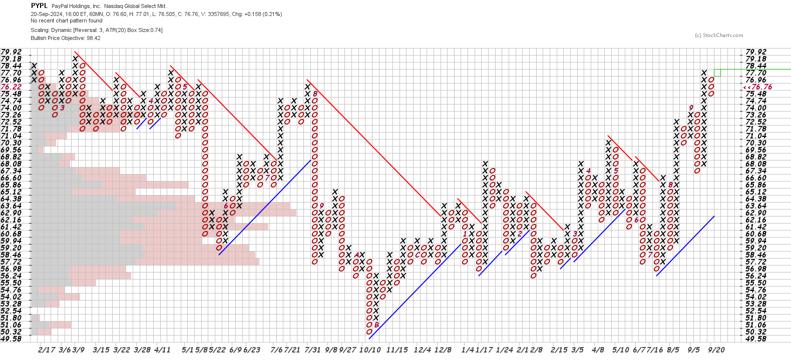
The long consolidation petiod eventually resolved to the upside. If price makes it to $78.44, we will have a double top breakout. That's the most basic bullish pattern on point and figure charts.
Thesis
PYPL has a healthy setup for a sustained rally that looks strongest on the weekly time time. The daily time frame is a bit cloudy from last week's wild price action. The monthly also shows signs of a bullish turn recently. Support in the consolidation zone from $55-65 looks strong and it's good to see price clearing the biggest volume level around $73.
Based on what I've seen, PYPL meets my criteria for a small trade now and might be a good candidate for additional trades if the longer time frames gain more strength and the trend solidifies. I don't have any trades on PYPL today.
Earnings are coming up for PYPL on October 31st. 🎃
Good luck in your trading this week! 🍀
Discussion