Sunrun's moment in the sun

The market threw some shade at solar stocks, but Sunrun (RUN) seems to be putting the right foot forward. Let's dig into some charts to see where it might go from here.

Happy Sunday! I've been busy reading about point and figure charts lately and I just finished Martin Pring's "Technical Analysis Explained" last week. These gave me some new perspective on charts and returned me back to good old price and volume.
I'll dig into Sunrun Inc (RUN) this week. I took a good look at the solar industry before, but something about RUN has caught my attention.
All investments come with significant risks, including the loss of all capital. Please do your own research before investing, and never risk more than you are willing to lose. I hold no certifications or registrations with any financial entity.
Let's dig into some data.
What's special about Sunrun?
I set up a scan last week for stocks in a breakout on their point and figure charts. For those of you who use the scanners on StockCharts, here's the criteria:
[ [group is sp500] # SPX
	or [group is sp600] # Small caps
	or [group is NASDAQ100] # NASDAQ 100
	or [group is ETF] # ETFs are cool, too
	]
and [SMA(5,volume) > 1000000] # Decent volume required
and [optionable is true] # I'm selling options here, y'all
and [PPO Line(12,26,9) > ppo Signal(12,26,9)] # PPO line needs to be over signal
and [PPO Line(12,26,9) > 0.0] # PPO line must be over zero
and [RSI(14) > 49] # In the top half of the RSI indicator
and [RSI(9) > RSI(14)] # Improving RSI recently
and [Price Relative(RSP) > yesterdays Daily Price Relative(RSP)] # Strength relative to RSP must be growing
and [SCTR > 60] # Long/Medium/Short technical indicators need to be decent
and [ [PnF Double Top Breakout is true] # I like breakouts
	or [PnF Triple Top Breakout is true] # Three is even better
	or [PnF Spread Triple Top Breakout is true] # Better over long time periods
	or [PnF Quadruple Top Breakout is true] # Whoa, four is awesome!
	or [PnF Ascending Triple Top Breakout is true] # Broke out once, did it again!
	]
If I run this scan and then sort by the SCTR, RUN pops to the second spot on the list just behind VST. Here's a point and figure chart for RUN:
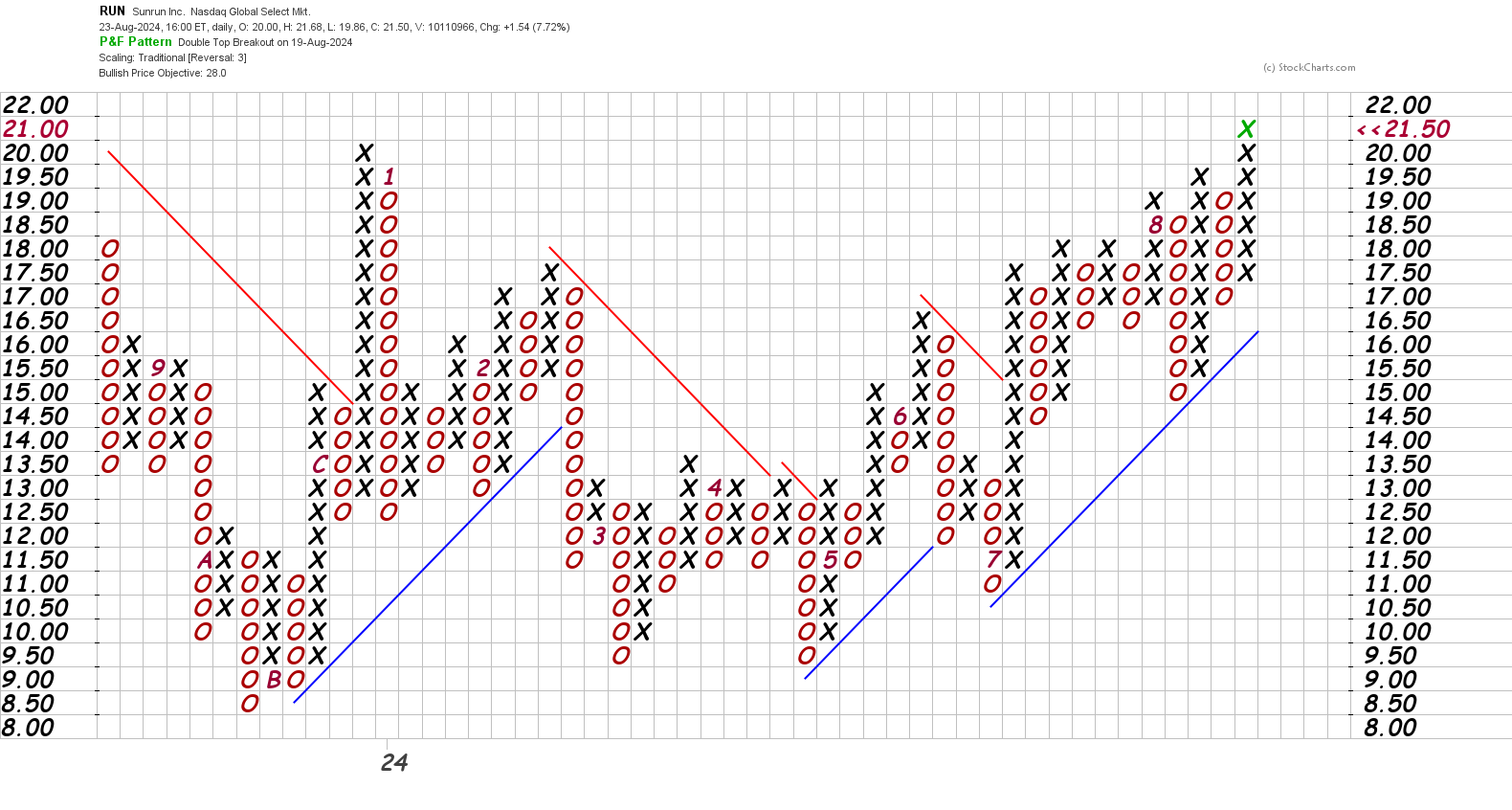
Outside of the August dip, we have a great ascending pattern out of a series of triangles that has been running since about $11 back in July (the red 7 on the $11.50 line). It recently made a double top around $19.50 followed by a breakout to $21.50. Double top breakouts are bullish signals on these charts.
Zooming out
Much like the other solar stocks, RUN had an incredible rally after the COVID drop. Here's a weekly chart since 2019:
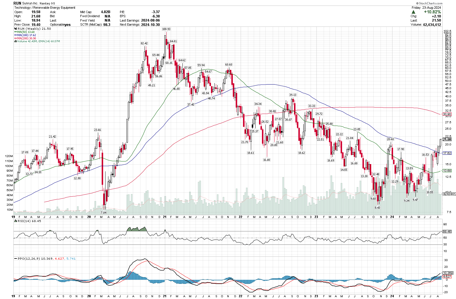
On the bearish side, we've had a long ride down from 2021's high and we have moving averages that are upside down. However, the RSI is firmly in the top half of the band and the PPO shows a move above the signal line above zero. That demonstrates that the momentum in the short term has shifted.
Going down to the daily reveals more detail:
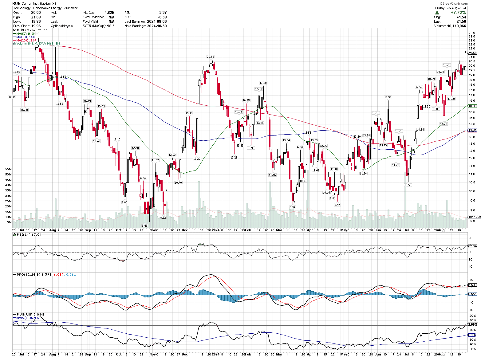
The moving averages just became properly stacked last week and the RSI is in the top half of the range. The PPO indicator looks pretty steady, which tells me that momentum may not be increasing rapidly, but it's not decreasing rapidly either. The indicator at the bottom is RUN's performance relative to RSP, the equal weighted S&P 500 index. That indicator crossed above the 50 day moving average in July and is now in positive territory for the first time since late 2023.
Volume studies
I recently did some reading about Buff Dormeier's "Volume Price Confirmation Index" after listening to his CMT podcast episode from 2023. He argues that volume leads price and that by combining both, you can get some early warning signals. There's a community-written VPCI indicator on TradingView (thanks to LazyBear!) and you can read much more about Buff's indicator and arguments in Issue 65 of the Journal of Technical Analysis from 2008.
Here's a daily chart of RUN with a year to date VWAP applied (green line) and the VPCI at the bottom:
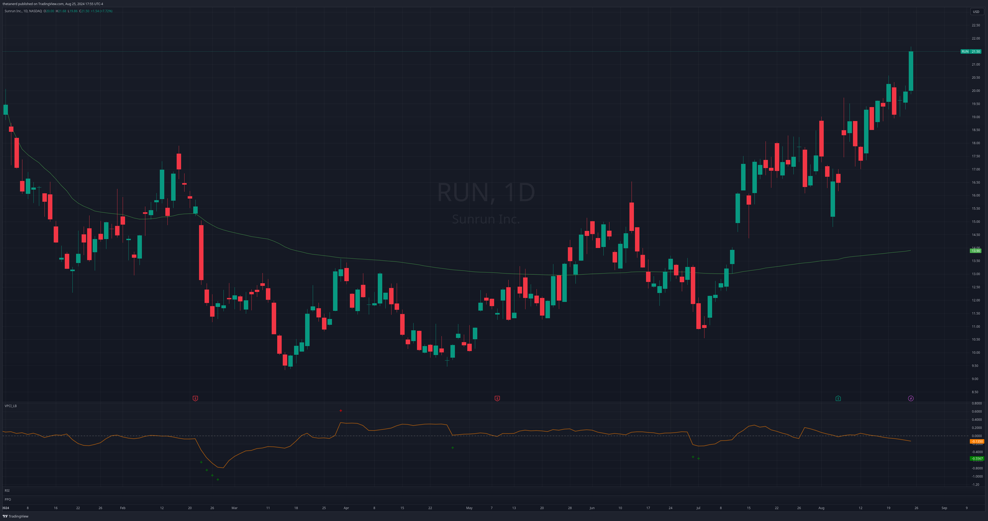
We're well above the VWAP line now and RUN had a quick drop in late June 2024 that was done on fairly low volume. Note the green pluses on the VPCI curve. That indicates that the move down was not well supported by volume and was not sustainable. There was another clue with a harami candlestick pattern at the lows. It was almost a morning start pattern, as well.
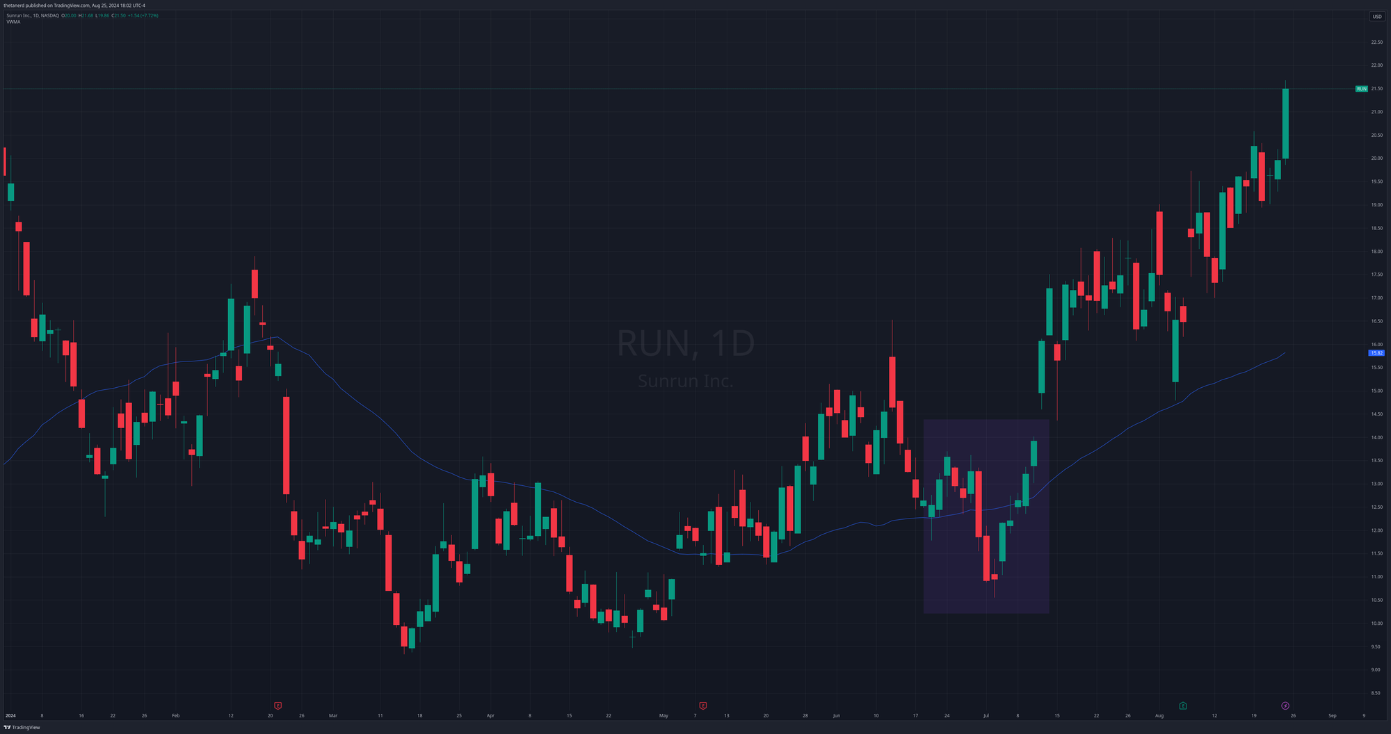
RUN has had decent volume on the ride up, but nothing that looks too extreme on the VPCI indicator. If we hide all the indicators except for a 50 day volume weighted moving average, we see that the drop in July (highlighted with the purple rectangle) barely made the VWMA line budge:
Thesis
The solar industry is still in a bit of a rut relative to the rest of the market, but RUN is certainly a top name right now. We have good volume on a move up with improving indicators across various time frames. Earnings are on October 30th.
The point and figure charts suggest that we have support around $16.50 and that's a spot where bulls have overtaken the bears on three occasions in 2024. The last run upwards began at $17.
I sold some $18 puts for October last week and I might sell some more this week. These solar names can be pretty volatile, so watch out for a potential reversal.
Good luck to all of you this week! ☘️
Discussion