Tracking the high volume close
High volume closes can give you an edge in the market by highlighting where traders with deep pockets have taken an interest in a stock or ETF. Let's learn how to track them. 🧐

Hey everyone! It's been a while since the last post. My life at home has taken some twists and turns lately. That has led me to cut back on trading and focus more on my trading skills.
One of these new skills is recognizing the high volume close on a stock chart. I learned this technique from a very friendly trader in the Volume Leaders Discord (thanks, Joe!)
But before we dive in:
All investments come with significant risks, including the loss of all capital. Please do your own research before investing, and never risk more than you are willing to lose. I hold no certifications or registrations with any financial entity.
Let's go.
Price and volume
There are only two things that won't lie to you in the stock market and they're both found on any stock chart for free: price and volume. Changes in either of these can point you to shifts in how retail and institutional traders are thinking about a particular stock, sector, or index.
There are many different schools of thought around the relationship of price and volume. Many argue that volume helps confirm price movement but some argue that volume leads price. Still others argue that some types of volume changes can signal moves by institution in the market and these institutions are the ones who really move the market.
If the idea of following institutional money flow interests you, you'll probably love How to Make Money in Stocks by William O'Neil. It's a great read.
High volume closes
A high volume close occurs on a stock chart when the volume in a certain period of time (day, week, etc) exceeds a multiple of the moving average of volume. For example, if the 20 day moving average of volume on a stock is 1M shares traded, but then one day it has 4M shares traded, this is a 4x (400%) jump over the average. This is something worthy of your attention!
However, when these high volume closes show up in conjunction with something else interesting, such as a news event, earnings call, or a partnership, this is even more important. For those of you who love memes, this may help:
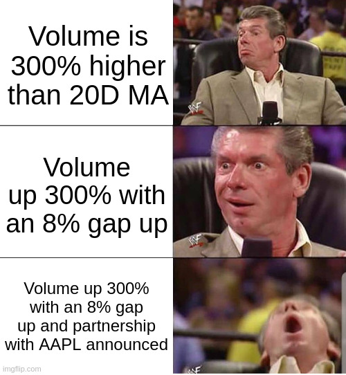
A volume reaction is significant, but a big price move with a gap is even more significant. The best is when you get a volume and price reaction along with some kind of news event that changes the core valuation of the stock.
Spotting these is fairly easy to a trained eye, but there are ways to quickly mark up your charts so that these events are much easier to see.
Volume Masking
A great trader kept sharing charts and it looked like his volume bars were "masked" by the moving average. Typically, a moving average shows up as a line over the volume bars and you must see if the bars are above the line. However, you can reduce the amount of information your brain needs to process by masking lower volume days.
Here's an example with DOCU:
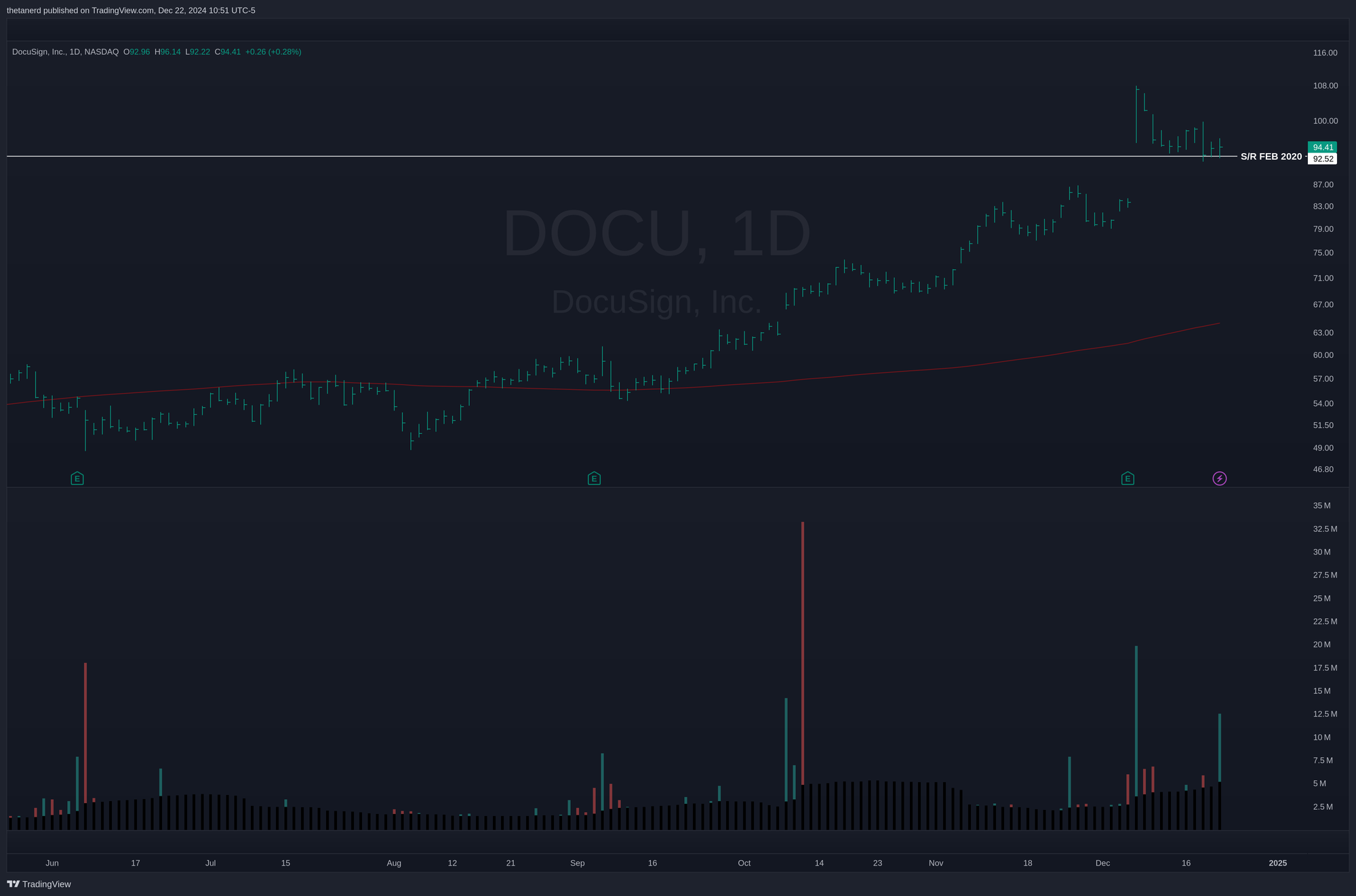
Note how the volume bars below the moving average are "masked" with black bars. The only bars you see are the ones that exceed the volume moving average. This makes it easier for your brain to scan through the bars and look for unusual events.
Bring up the settings for your volume indicator in TradingView and make these adjustments:
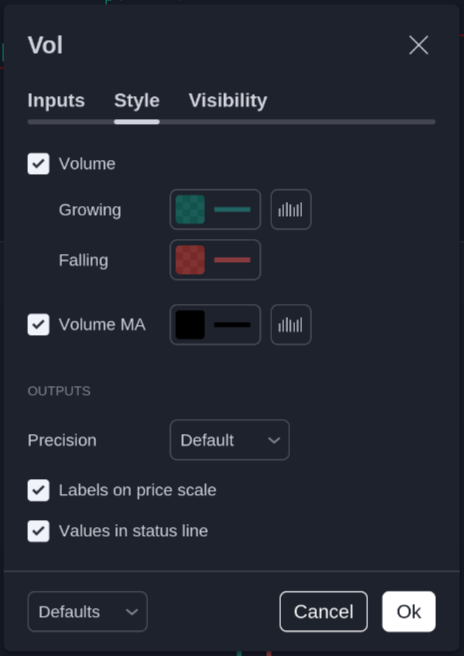
- Make the moving average black, set the width of the line to the maximum, and change it from a line to a histogram (little box to the right of the color).
- In the growing/falling colors, change the line width to the max.
- Click the small box to the right of the green color (for growing) and change the style from columns to histogram.
Now the low volume days will be hidden from view! For those of you with light charts, you might want to consider white or a light gray for the masking color.
HVC easy mode
Spotting high volume close (HVC) days gets much easier with masking, but can we make it one step easier? Of course we can! This will require adding a custom indicator. Here's my "HVC Finder" indicator in action on DOCU:
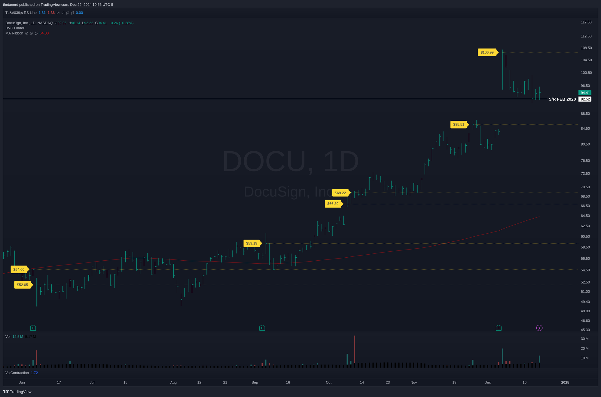
My indicator adds the yellow lines and labels on days where volume exceeds the 20 day moving average by at least 300%. On each of those days, the closing price gets a label and a line. You can add this indicator to your chart by opening the Pine Editor at the very bottom of your TradingView window and choosing Create New... at the far left side.
An editor pops up underneath and you can add this code into the box:
// Copyright 2024 Major Hayden
//
// Licensed under the Apache License, Version 2.0 (the "License");
// you may not use this file except in compliance with the License.
// You may obtain a copy of the License at
//
//     http://www.apache.org/licenses/LICENSE-2.0
//
// Unless required by applicable law or agreed to in writing, software
// distributed under the License is distributed on an "AS IS" BASIS,
// WITHOUT WARRANTIES OR CONDITIONS OF ANY KIND, either express or implied.
// See the License for the specific language governing permissions and
// limitations under the License.
//
//@version=6
indicator('High Volume Close (HVC) Finder', shorttitle = 'HVC Finder', overlay = true, max_labels_count = 500)

// USER INPUTS
i_MALength = input.int(20, minval = 1, title = 'Volume MA Length')
i_VolumeThreshold = input.float(3.0, title = 'Volume multiplier', tooltip = 'Volume required over moving average to classify as an HVC (3 means 300%)')
i_MaxLines = input.int(5, minval = 1, title = 'Events displayed', tooltip = 'Set the maximum number of recent HVC lines to draw')

// COLORS
i_LabelColor = input(color(color.yellow), title = 'HVC Label', inline = 'Colors')
i_LabelTextColor = input(color.black, title = 'Text', inline = 'Colors')
i_LineColor = input(color.yellow, title = 'Line', inline = 'Colors')

// DISPLAY SETTINGS
i_ShowPercentage = input(true, title = 'Show % Multiplier', group = 'Display Settings')
i_ShowClosingPrice = input(false, title = 'Show closing price', group = 'Display Settings')

// Calculate the moving average of volume
vol_ma = ta.sma(volume, i_MALength)

// Check if the volume exceeds the threshold
high_vol = volume > vol_ma * i_VolumeThreshold
vol_ratio = volume / vol_ma * 100
vol_str = str.tostring(vol_ratio, '#') + '%'
close_str = '$' + str.format("{0,number,0.00}", close)

// Construct label text dynamically
label_text = ''
if i_ShowPercentage
    label_text := vol_str
if i_ShowClosingPrice
    label_text := label_text + (i_ShowPercentage ? '\n' : '') + close_str

// Array to manage the lines
var line_array = array.new_line(i_MaxLines)

// Function to create label and line
create_label_and_line(_bar_index, _high, _close, _label_text) =>
    // Add a label to the candlestick
    label.new(_bar_index-1, _close, text = _label_text, style = label.style_label_right, color = i_LabelColor, textcolor = i_LabelTextColor)

    // Create a new line
    new_line = line.new(_bar_index, _close, _bar_index + 1, _close, color = i_LineColor, width = 1, extend = extend.right, style = line.style_dotted)

    // Add the new line to the array
    array.push(line_array, new_line)

    // Ensure the array only keeps the last i_MaxLines lines
    if array.size(line_array) > i_MaxLines
        old_line = array.shift(line_array)
        line.delete(old_line)

// Trigger the function if high volume
if high_vol
    create_label_and_line(bar_index, high, close, label_text)
Save the file in the editor and then click Add to chart on the right side of the editor. You're all set!
The indicator has a few configuration options where you can set the moving average length, your volume cutoff, and the numbers of recent HVC lines you want to see. Every HVC gets a label but only the most recent ones have lines applied.
Using the HVC indicator
It's key to remember that HVC candles mark interesting places on the chart where price may do something unusual. It could be where a correction stops or where a rally runs out of steam. They can form strong support or resistance levels. However, when something big has changed, these lines can become your "line in the sand" where you set stop losses or switch from a long to short bias (or vice versa).
Whatever you do, remember this: There are no guarantees in the market and price can slices through these levels in any direction without warning. An HVC is not a guarantee.
Examples
Let's run through a few examples. First up is LMND:
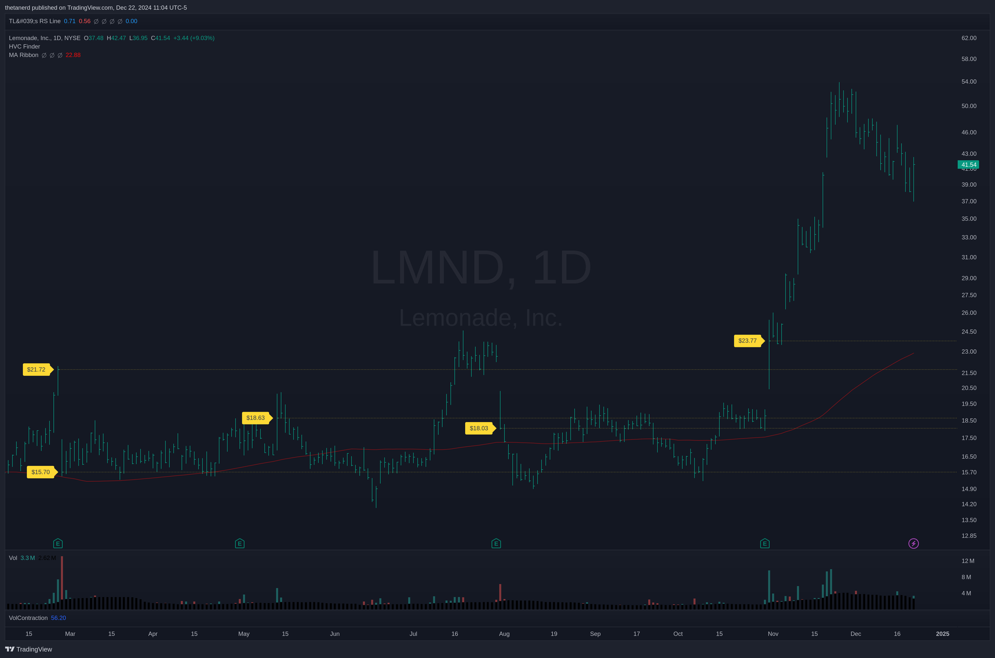
LMND started off with two HVCs at $21.72 and $15.70 that served as strong resistance and support levels. Price broke above the top level in July, but fell back into the channel. Price action in August, September, and October turned into a volatility contraction pattern (VCP) and when the price flew above the top level at the end of October, it kept running!
Here's another with MSTR:
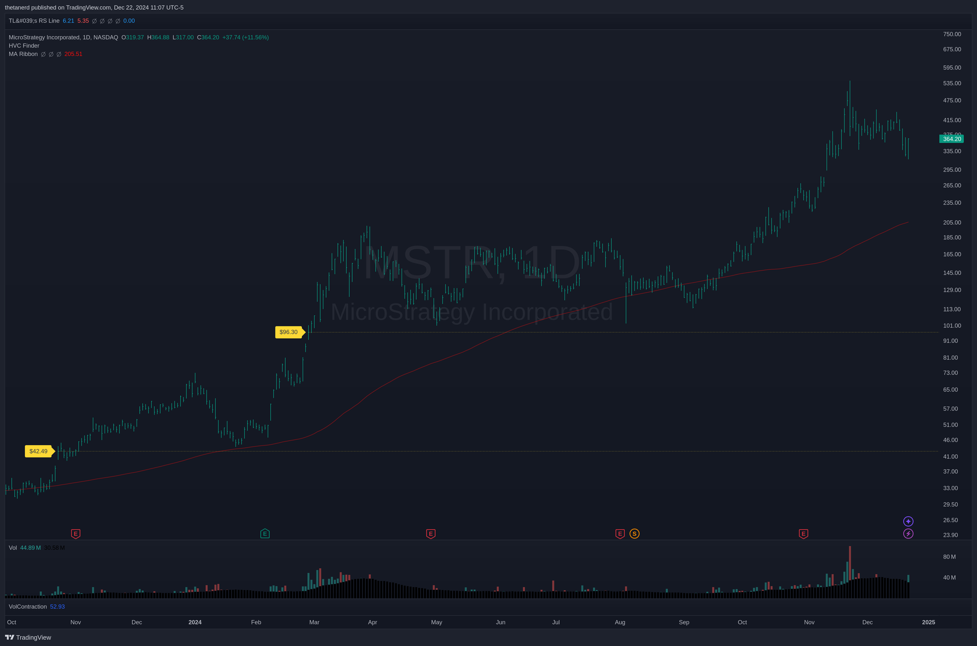
Notice how the $42.49 HVC was touched in early 2024 and price jumped up shortly after. Then there was another HVC at $96.30 that was revisited in May and August before a big move higher starting in September. One might argue that the support level was obvious if you drew a horizontal line across the lows, but it's challenging to remember to do that if you're reviewing a lot of charts each week.
This technique works on ETF's, too! On really high volume ETFs, such as SPY, you might need to look for other more lightly-traded ETFs to find HVCs. For example, Vanguard's SPY competitor is VOO and it has some interesting levels:
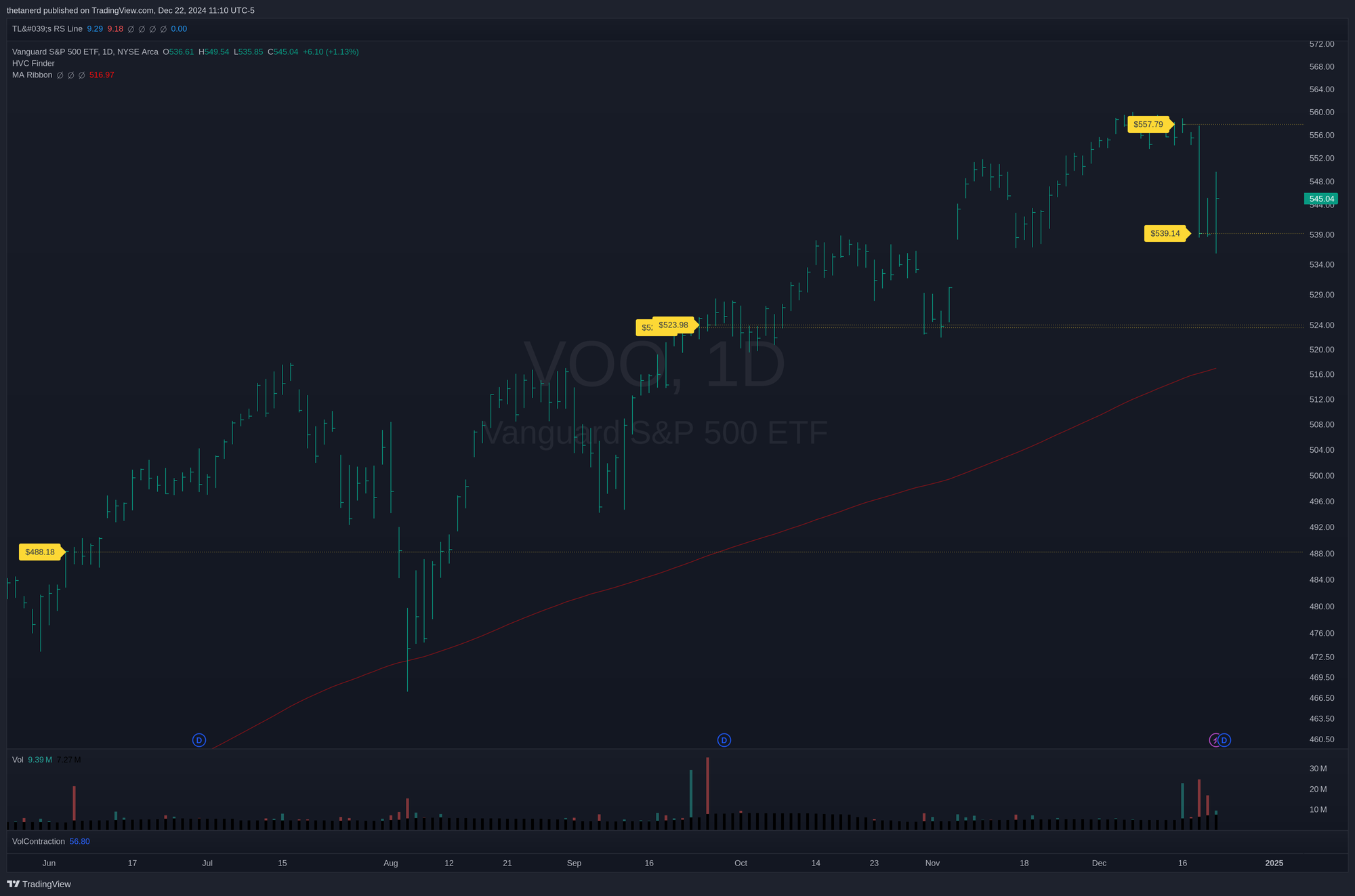
Starting from the left, VOO overshot the $488.18 HVC to the downside during the August correction but then quickly bounced back up off the 150 day / 30 week moving average. Two more HVCs appeared in September back to back and they served as support during the late October dip.
Most recently, an HVC appeared at the highs just before the Federal Reserve interest rate decision. Another one appeared at the lows around $539. This is a good reminder that HVCs can be signs of bets in either direction – long or short – and it's a good idea to see how the market reacts to them after they appear.
If you're curious about S&P 500 HVCs, take a look at other ETFs such as IVV and VOO. The leveraged and short ETFs, such as UPRO, SPXL, and SPXS, have less volume and it's easier to spot HVC candles there.
Summary
Tracking big volume days can give you hints about where institutions are making big bets on certain areas of the market. Masking volume helps you track them vertically (from the volume bars), but applying horizontal lines to the closing prices also helps you track how price moves around those levels later. Although HVCs don't tell you if the bet was bullish or bearish, they highlight really interesting levels that are worth your attention.
Good luck to everyone this week and I hope you and your family have a very happy holiday season. ☃️


Discussion