How I use Volume Leaders charts in my trading

Learn how I use Volume Leaders to supplement my existing chart work when I trade stocks and options. Tools are useful when used properly and when you know their limitations. 🛠️

Happy Friday! 👋 This week has been a wild one with the market driving lower after weaker economic reports arrived. I'm almost entirely in cash now after taking some difficult losses in July.
I use Volume Leaders often to highlight important levels for my trades and although the service offers some very helpful data, the charts and data can be difficult to interpret. This post covers how to interpret the charts and the data they include. I'll also share some of my trading strategies using these charts.
But first:
And also:
With that out of the way, let's get this thing underway.
What does Volume Leaders do?
You've heard me say it often: price and volume are the only things in the market that won't lie to you and they're on every stock chart for free. Volume Leaders takes this concept to the next level by highlighting very large or unusually sized trades across lots of stocks and ETFs.
In addition to highlighting these trades, they give you a relative size of the trade to the average trade size in that stock or ETF. This is extremely helpful since the average trade size on SPY, the S&P 500 ETF, is vastly different than a lesser known ETF, such as VIG, Vanguard's high dividend ETF. A few billion dollars changing hands in SPY is not exciting, but it is in something like VIG.
Volume Leaders also tracks the rank of the trade among all of the trades made since the stock or ETF began trading. This helps you assess just how big the bet is relative to other large trades made. For example, if you see that a trade ranks as #5, that means it's the fifth biggest trade since that stock or ETF began trading. That's worth your attention! 👀
What does Volume Leaders not do?
The most important reminder I give people about Volume Leaders is that it does not show directionality of a trade. In other words, when you see a massive trade, it's not possible to know the sentiment behind that trade. For example, a big trade could be any one of these situations (or perhaps more than one):
- Someone entering a new long or short position
- Someone taking down all or part of an existing long or short position
- Someone adding to an existing long or short position (doubling down)
- Someone hedging another part of their portfolio
- A large trade lands from multiple retail traders in an exchange where trades are handled in bulk
- Two financial institutions making a deal off-exchange and reporting it to the market late
- ETF holding re-balancing (often near market close)
This service marks the spot where volume was heavy and essentially says "something unusual happened right here." It's up to you to understand what the sector is doing, what else is happening on the chart, and what important events might be around the corner in the market.
Interpreting Volume Leaders charts
There are two great Volume Leaders features: trade listings and charts. Let's do the charts first!
Every chart comes with a very detailed configuration screen that allows you to choose exactly how the chart should look:
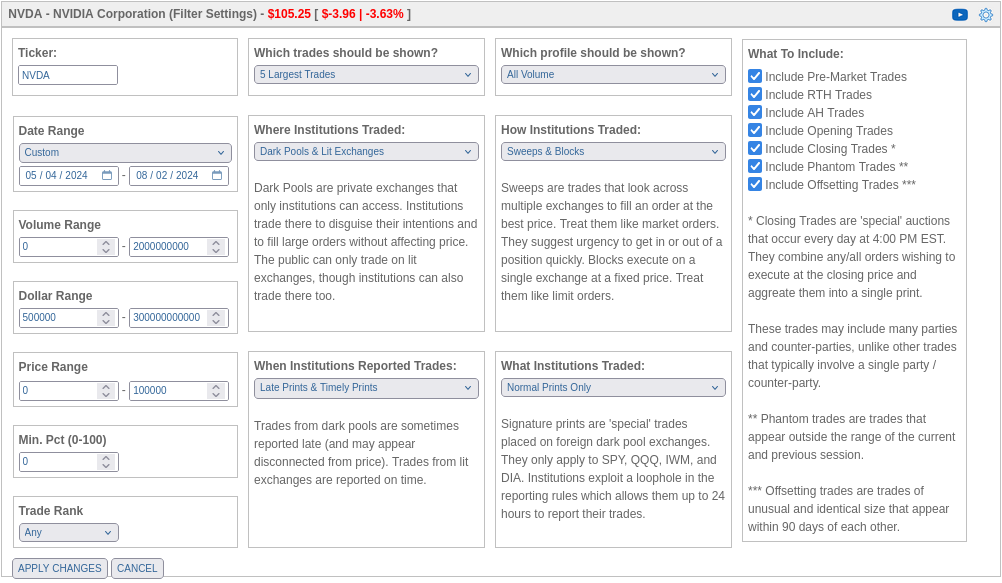
At this point, you should read the Getting Started guide for a detailed look at what these options mean. I usually change the ticker, date range, and the number of trades to be shown. Everything else is left as defaults. Here's how NVDA's chart looks:
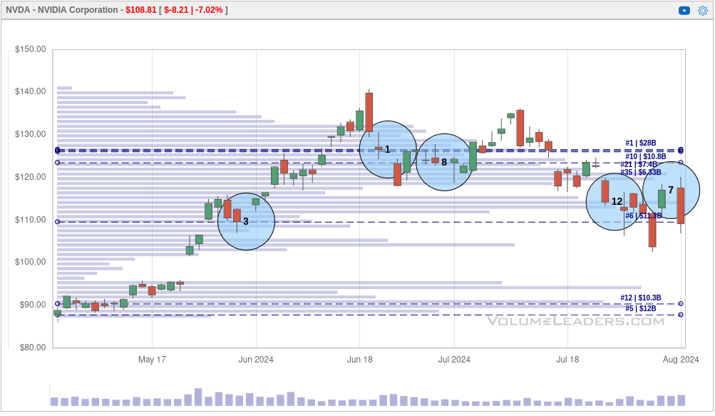
We have our usual candlesticks along with a volume by price indicator in the background. There are two additional things to note:
- Blue circles: Each of these denote an unusually large trade being made at a particular price point. If you hover your mouse pointer over each, you can get details on the trade itself. The numbers inside the blue circles indicate the rank. The #1 trade around June 21 was the largest single trade made on NVDA since it began trading.
- Dashed horizontal lines: These lines highlight large volume levels. These are helpful because an old trade might not show up on your time frame, but the volume level is still present as a reference. At the right side, you see the volume level's rank and how much was traded there (in billions of dollars, for NVDA). These ranks are the same as the ranks in the blue circles.
Using Volume Leaders charts to trade
Everyone has their own methods for using the data, but I consider all of these large trades to be interesting levels to watch. Let's take a chart for AMD as an example and I'll give you my thought process:
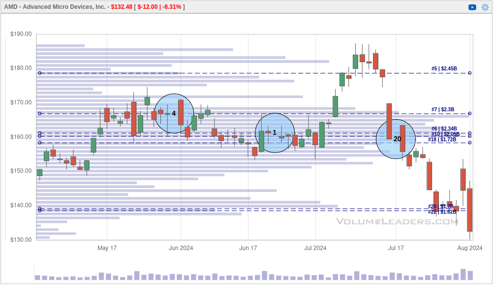
Going left to right on the chart, here's my assessment:
- #4 arrived during a consolidation at AMD's highs (at the time) in May/June, which is normally a good sign.
- #1 arrived at the end of the consolidation after a Wyckoff spring occurred around June 18th. That's normally a bullish sign and might signify a good entry point.
- AMD then went through a blow-off top to its March/April high and then failed. #20 was likely someone opening or adding to a short as AMD ran lower into August.
- Looking back at #1, I'm thinking it might have been someone exiting a long position or perhaps a new short anticipating a blow-off top.
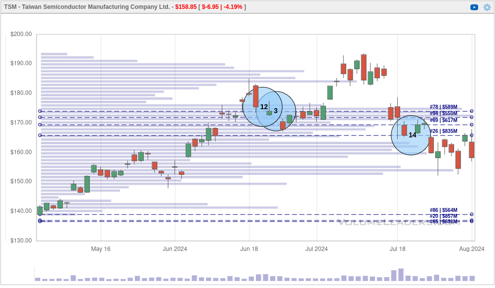
The potential short at the #1 spot becomes more apparent when you compare it to NVDA's chart (scroll up to the previous section) as well as the chart for TSM below:
As a recap, my process normally involves:
- Check the chart for the stock or ETF that interests me.
- Find charts for very similar companies or ETFs and compare them. This helps to determine if something is happening sector-wide, or it's something affecting only one stock.
- Go to the regular stock chart and look for strength and weakness in momentum (PPO and RSI are my favorites) along with candlestick patterns that might point to an upcoming change.
If any of the levels are very large, I begin looking at them as potential reversal targets. If a stock has been rallying for months and a #1 trade arrives, I see that as a potential bearish reversal. If market participants have made easy money for months and suddenly someone makes a huge bet, I start to think that a trader is looking to catch a lot of other traders being complacent.
I add some of these levels as alerts on StockCharts so I know when the stock price crosses through them. For example, if a #1 trade comes through, I add an alert. If the price crosses that level and can't break through it again from the other size, that's a huge red flag that a new trend is in place.
Sometimes charts are confusing
The examples I provided above have lots of history available and it's super easy to look backwards and determine what price action was doing. What about when you don't have the full story? Here's an example of TNA, the leveraged Russell 2000 ETF as of today, August 2nd:
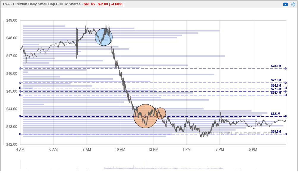
Okay, a #2 trade is a big deal. It came in at the lows of the day, but there aren't any ranked volume levels nearby.
How do we better understand the context? I went back into Volume Leaders to get a 90 day chart of TNA with the five biggest trades shown:
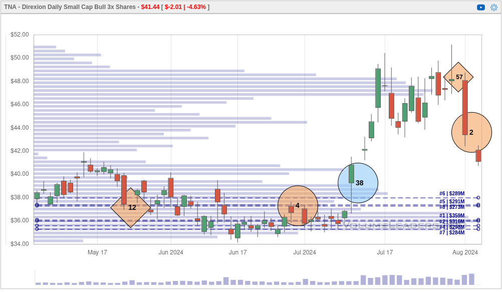
We see TNA consolidating through May/June with a big #4 trade as it made a massive move up to $50. Once we hit $50, the rally fell off quickly and the #2 trade arrived. Could this be a new short? A long exiting? A long trader doubling down?
What does IWM (the non-leveraged small cap ETF) say?
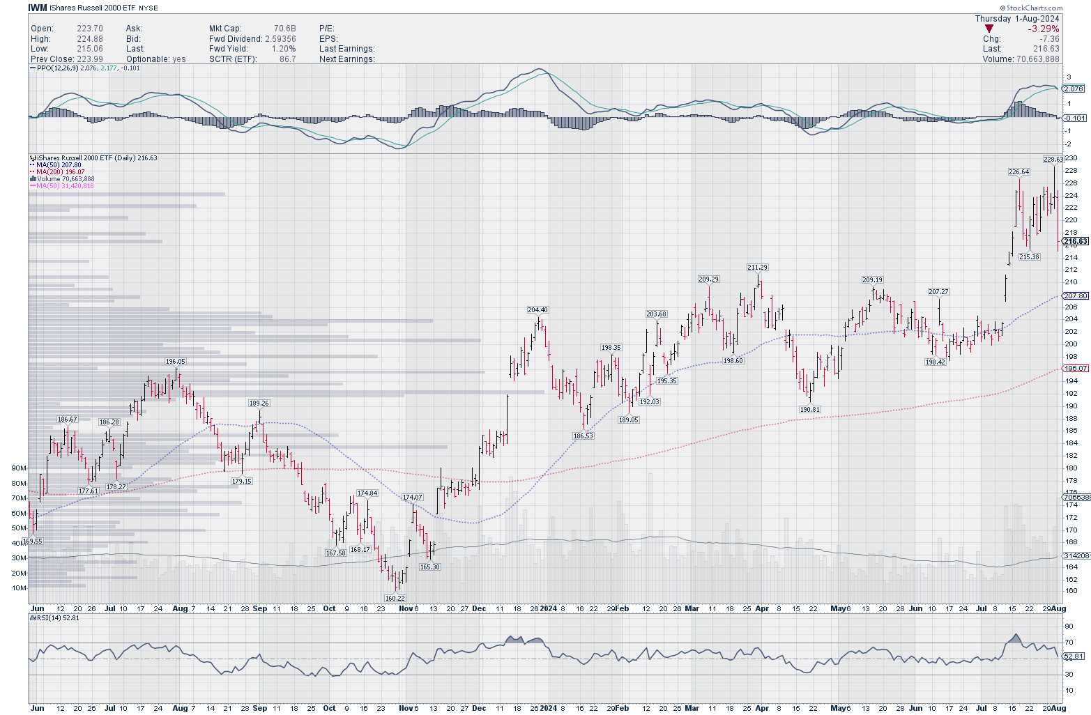
We've made a chart pattern called an island. This is when we gap up, price creeps up a bit more, and then it falls back down. Sometimes it falls enough to close the gap and return to an older pattern and sometimes it doesn't. The PPO indicator at the top suggests the momentum stalled once IWM went into the island pattern and the new high around $228 was not made with more momentum. The RSI indicator at the bottom made lower highs, too.
So the chart shows a common pattern with weakening indicators after a decent gap up. The #2 trade arrived on a brutally red day. This makes me think that someone is bearish on small caps, at least in the short term. All of that gives me a little more confidence to make a bearish bet (with appropriate position and risk management) on IWM or TNA for a short term move.
Volume Leaders trade listings and alerts
You can also look at lists of large trades in Volume Leaders and filter them based on what interests you. They offer filters for individual tickers, sizes, dates, and trade types. Once you know what you're looking for, you can add alerts to receive emails when trades arrive that match your criteria.
Volume Leaders offers lots of helpful predefined filters that are sufficient for most of my trade research.
Summary
The value in Volume Leaders for me is really around highlighting critical levels for trading stocks and ETFs. I can get lots of this from my stock charts already, but Volume Leaders tracks it in a way that is very easy to add to your existing system. You can add the levels as alerts, use them as stops for your trades, or use them to build a trading plan.
However, it won't tell you why the trades were made. That for you to decide based on your own research. Combine your existing technical analysis and your knowledge about the sector or industry to increase your odds of a winning trade. All of your existing trade rules in your trading system still apply!
Good luck to all of you! 🍀
Discussion