What signals are the markets sending?

Various markets are sending lots of signals to us each week. Let's examine some charts to see what's getting stronger and weaker lately.

Hey there! With the stock market rolling over again last week, what signals are the market sending us? That's what I'll be digging into this week.
All investments come with significant risks, including the loss of all capital. Please do your own research before investing, and never risk more than you are willing to lose. I hold no certifications or registrations with any financial entity.
Let's get into some charts.
Needs and wants
One of my favorite methods of measuring the market's appetite for risk is to compare two ETFs: XLY and XLP. XLY is the Consumer Discretionary sector ETF and includes familiar names, like Amazon, Tesla, McDonald's, and Starbucks. XLP is the Consumer Staples sector ETF with companies like Walmart, Coca-Cola, and Colgate-Palmolive. This is my things you want versus things you need indicator.
If you compare XLY to XLP in a relative strength chart, you end up with this:
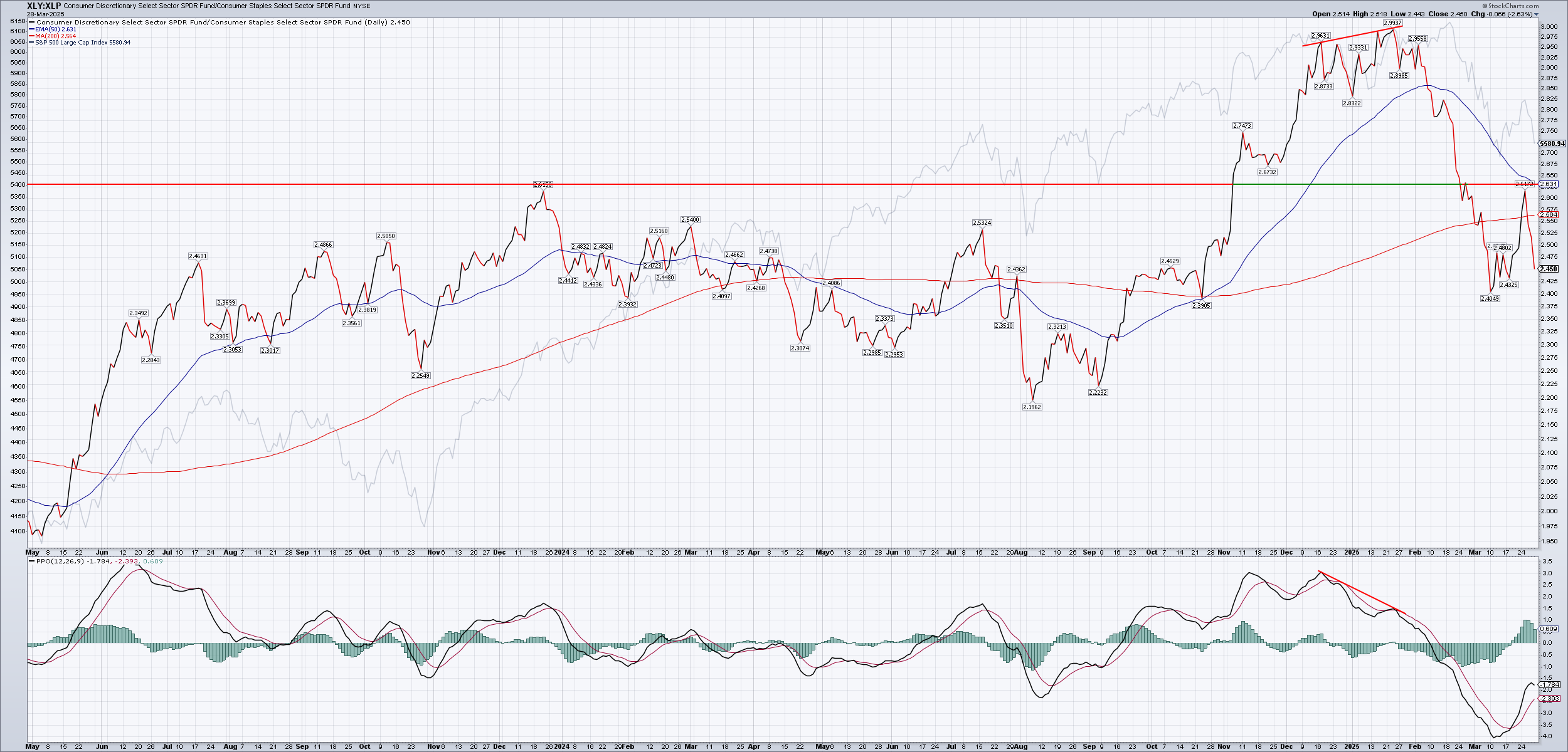
When this chart moves higher, XLY is leading XLP and this suggests the market is in a risk-on mode. Traders retreat to safety during riskier periods by selling XLY and buying XLP and you'll see this chart move down. There are some situations where traders end up selling both, so it's important to check the individual charts, too.
While XLY/XLP made higher highs, the PPO (percent price oscillator) indicator was not making a new high. It was headed much lower. The XLY/XLP chart bumped against a resistance level this week and fell back down. It hasn't made a lower low quite yet.
This chart suggests that traders are not ready to take on more risk yet.
Growth and value
Another method for tracking how traders are analyzing risk is to look at growth versus value. There are many ETFs in both of these categories, but there are two main sets of relationships I like to examine. First up are two S&P 500 ETFs, SPYG and SPYV:
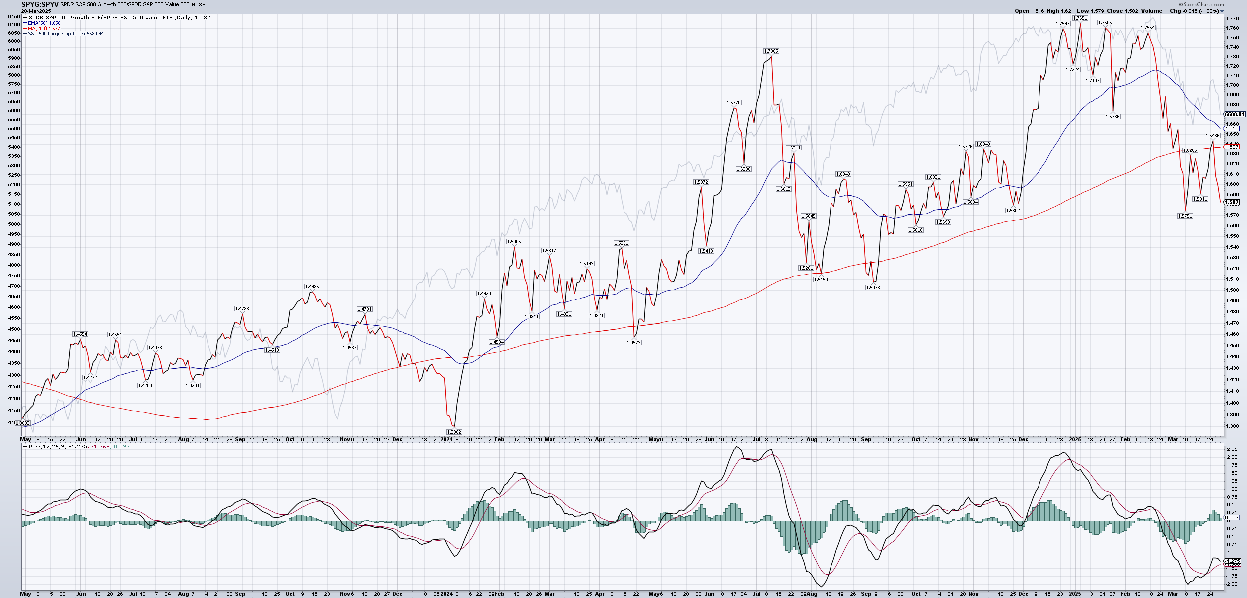
This chart moves higher as growth leads value and it drops as value takes the lead. Notice again how the early 2025 highs were made on lower PPO indicator values. This suggests that although growth was trying to lead, it was losing strength with each new high.
When traders are concerned about risks from inflation, interest rates, and many other aspects of the market, they pull back from growth names and look for value stocks. Although value stocks don't typically move higher with as much speed as growth stocks, they have much less volatility and the downturns hurt a lot less.
Another way to view growth versus value is through the Russell 1000, which includes more stocks. This relationship is IWF/IWD:
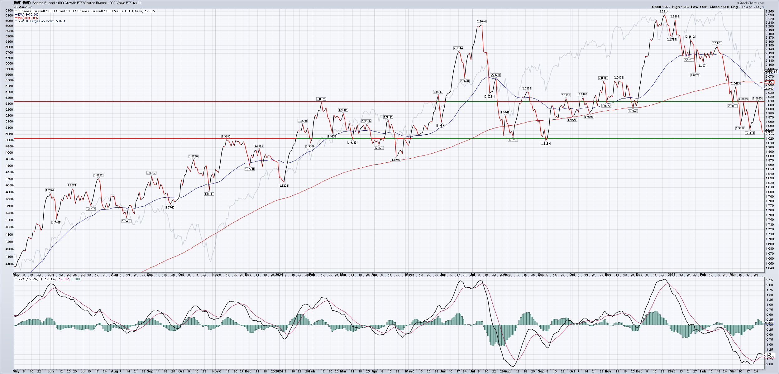
I've drawn some support and resistance lines here from some spots where the relative price became bounced in the past. What's interesting to notice here is that in 2025, price came down to the support level, bounced up, and then fell through the level quickly. After that, the relative price made a new low during the middle of march, tried to make a new high, but fell back once more.
Why does all of this matter? As it turns out, many institutional investors have requirements where the majority of their funds must be invested in the market somewhere. When growth begins to fail, they move to value. When technology fades, they move to health care, energy, and staples. Sometimes they move money into trades outside the USA (more on that later).
I'll be interested to see if this relationship makes a lower low and how it reacts around the next support level. So far, two rejections off the resistance level with a lower low makes me think that growth isn't showing much strength.
Housing
The US housing index ($HGX) often leads the market. It's a cap-weighted index of various stocks involved in home construction. Notice how the SPX (shown as a very light grey color) starts to show a topping pattern as $HGX falls in December 2024:
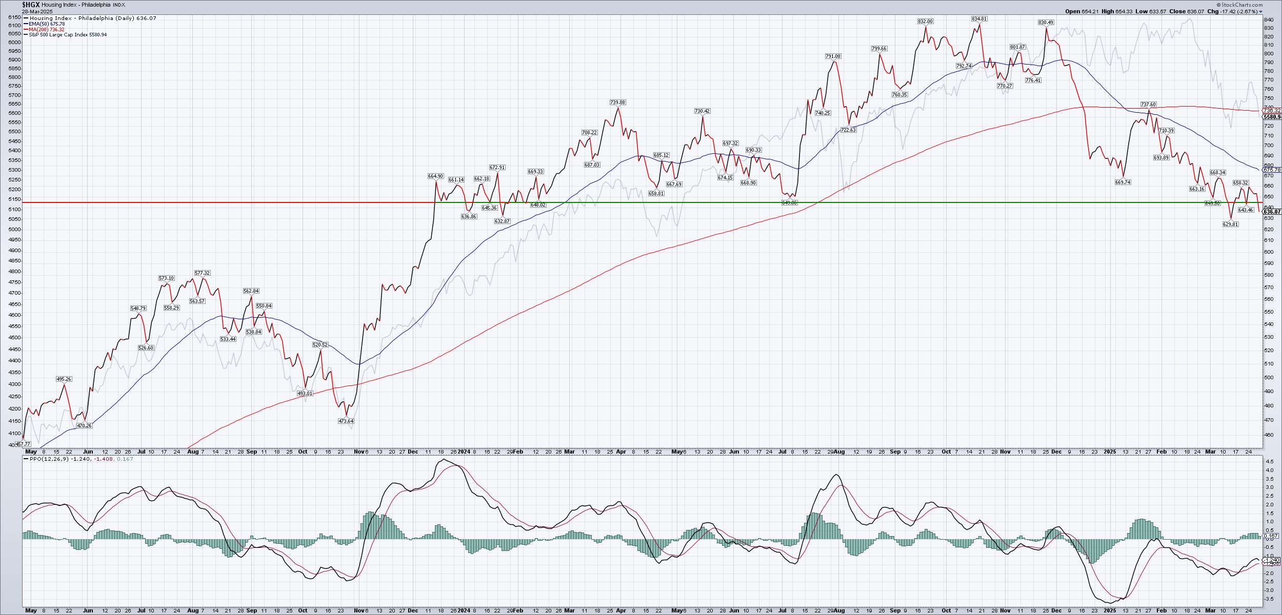
Scan left to 2023 and note how $HGX led the SPX during the summer of 2023 and led again after the October 2023 drop. That was when the market turned and the 2024 rally began.
Where is the $HGX today? It ran down to support, fell through, retested support again from the top and fell through once more. That's not a strong look.
Outside the USA
Sometimes money leaves the USA entirely for investments in other places. VXUS is a Vanguard ETF that invests in stocks outside the USA. Here's a relative chart of VXUS to SPY:
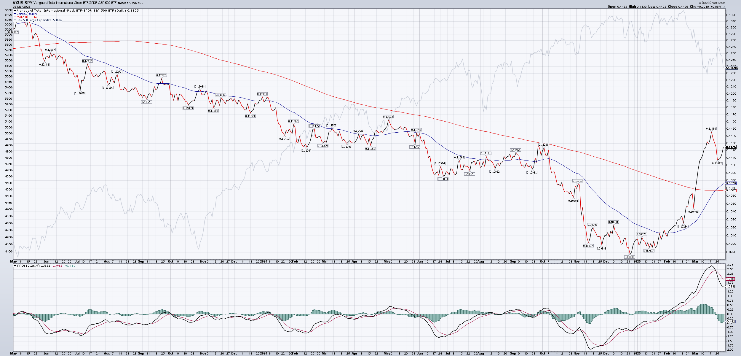
VXUS versus SPY has been in a downtrend for a very long time, but something interesting has happened recently. Price hopped over the 50 and 200 day moving averages, the 50 day crossed over the 200 day, and the relative price seems to be making a cup and handle pattern. Cup and handle patterns raise the probability of a bullish move.
A bullish move in this relationship means that VXUS, or stocks outside the USA, have a slightly better probability of being stronger than US stocks in the short term. Could this potentially break the downtrend of this relationship and put international stocks in a position to lead for weeks, months, or years? That's possible and this is worth watching.
Summary
It's difficult to find bright spots in the market right now. Some areas of the market are seeing some strength and several stocks put in new all time highs each day. However, the leaders of the last rally (large cap tech stocks) are struggling now.
It's important to look for what the market is trying to tell you without getting bogged down in the why. The market's moves are a sum of all kinds of traders with all kinds of different goals. Some traders measure the length of trades in seconds or less. Some measure them in years. While some traders might move millions or billions of dollars in a single trade, other traders are investing a few hundred every two weeks in their retirement account. Different rules and regulations apply to different types of traders. It is the sum of these movements that are most important to watch and you can get them on any stock chart for free.
When the market moves from growth to value, it's best to ask yourself "How am I going to adjust my account holdings for this change?" rather than "Why is this happening?" Digging into the why is exhausting, much like trying to predict where the market is going to go next. Just don't do it. It will make you tired.
Financial news sources, Twitter/X Furus, and all kinds of subscription services want to give you the why. They tell you they have the answers. The only problem is that they don't have the answers. They have a narrative. And they want to sell this narrative to you. The only problem is that trading on someone else's narrative will end up costing you a lot more.
Take time to sit down and crunch through some charts. Notice relationships that move in ways you didn't expect. Compare various assets to each other and think about how you should react to movements, especially relative movements, in those assets.
I have a public chart list on Stockcharts that I'm keeping updated on a regular basis with lots of market measurements (no stockcharts.com account required, but if you do sign up, tell them major@thetanerd.com sent you).
Another great resource is the Ciovacco Capital videos on YouTube each week. Chris makes videos each week for his investment clients and shares them with the world. I've learned a lot of the relative chart strategies from his work.
Good luck to everyone in the market this week. 🍀
Discussion