April Breadth Check 🍞

It's time for a high-level look at where money is moving in the market. No emotions nor clickbait here -- just real data you can use. 🧠

Happy Tuesday, everyone! With the market appearing to turn a corner this month, I thought it was another good time to check in on market breadth. This refers to how the market is moving at a high level. Are there more sellers than buyers? What evidence can we use to determine that?
All investments come with significant risks, including the loss of all capital. Please do your own research before investing, and never risk more than you are willing to lose. I hold no certifications or registrations with any financial entity.
Let's get right into it.
My everything chart
I enjoy making charts in TradingView that give me all my tools in one chart so I can look at price movements in SPX at the same points where breadth indicators change. You can view my breadth chart in your browser at any time, but here's how today looks:
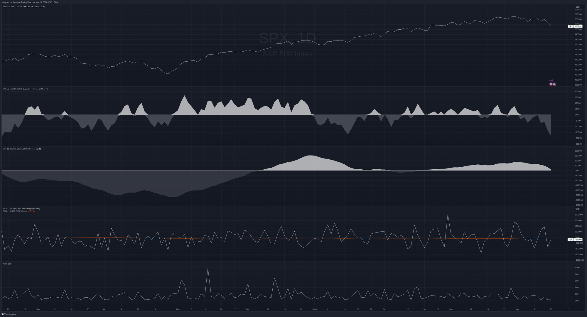
From the top down, here's a list of what's in the chart:
- SPX daily line chart
- McClellan Oscillator
- McClellan Summation Index
- Tick index (NYSE)
- Advance/Decline Ratio (ADR)
Click on any of those links to read more about what these indicators do. 😉
The McClellan Oscillator has run below the zero line aggressively and the last time it was this low was August 2023. The McClellan Summation Index is approaching the zero line now and it last fell below that line in early February. Note that the McClellan Oscillator spent most of its time above the zero line during the early part of the late 2023 rally but then started to get rocky as the SPX fought to climb over 4800.
The tick index is another way to look for market conditions which have gone strongly in one direction of the other. Just like RSI, this indicator is subject to interpretation. Some see extremes as a sign of strength while others see it as an indication that the market is about to change direction. The two most recent highs there show higher odds of a bearish move incoming.
Finally, the ADR gives us the ratio of stocks that closed higher relative to those that closed lower. A reading close to zero tells us that very few stocks were advancing, but big upward spikes hint that more stocks rallied higher on the day. We finished yesterday at a paltry 0.25. 👎
What else?
Next up is a look at the NYMO and NAMO charts. These are the charts of the McClellan Oscillator for each market individually:
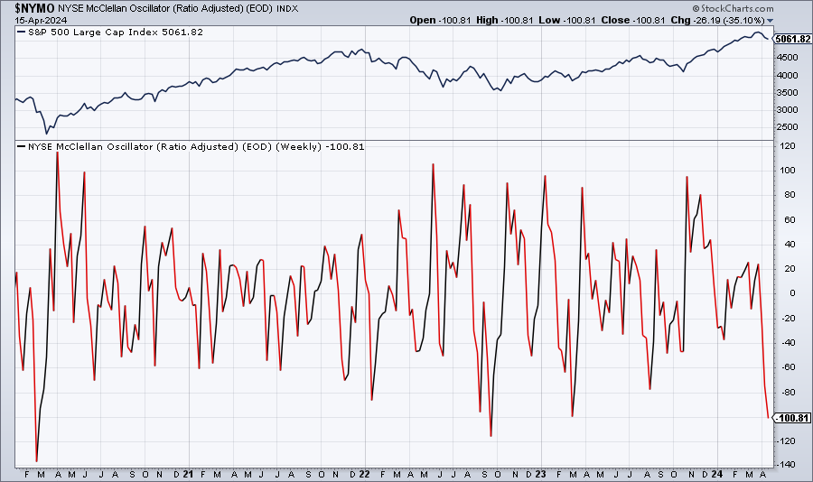
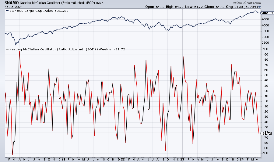
NYMO/NAMO charts since COVID
StockCharts calculates these a bit differently with a ratio adjustment. On the NYSE, we're touching levels we haven't seen since March 2023. Our next stop is to touch the level from late 2022 when the market showed signs of hitting a bottom from interest rate fears.
We can also look at the NAAIM chart, which examines the NAAIM Exposure Index:
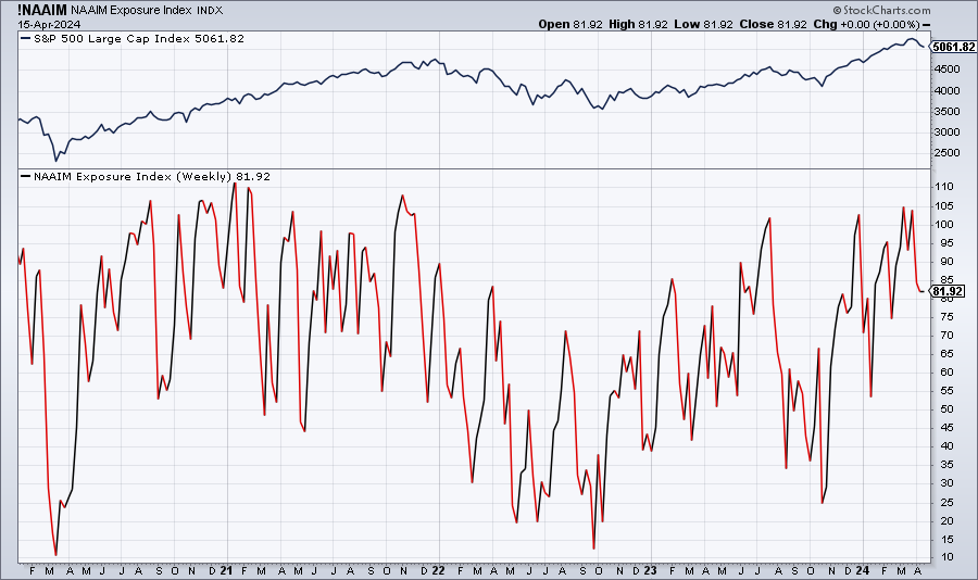
This shows that investment advisors still have plenty of long exposure, but they've cut that back a bit. Their exposure has been trending up since late 2022.
We also have the bullish percent indexes for NYSE and NASDAQ:
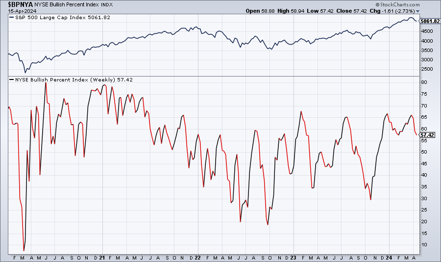
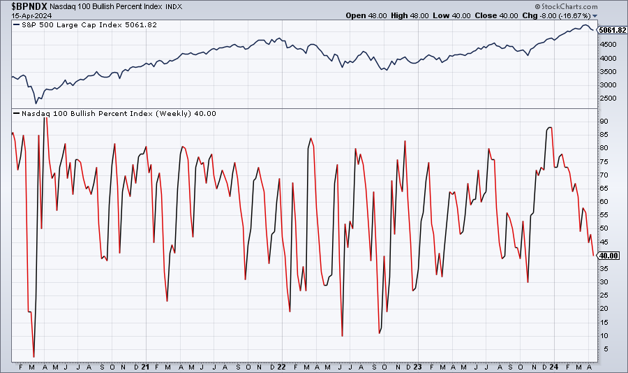
Bullish percent indexes for NYSE + NASDAQ since COVID
Bullishness in the NASDAQ has retreated to about 40% while the NYSE remains around 57%. This may suggest that the NASDAQ is under a bit more pressure.
SPY in detail
What's SPY up to lately? Here's a 195m chart (two equal bars per day) since February:
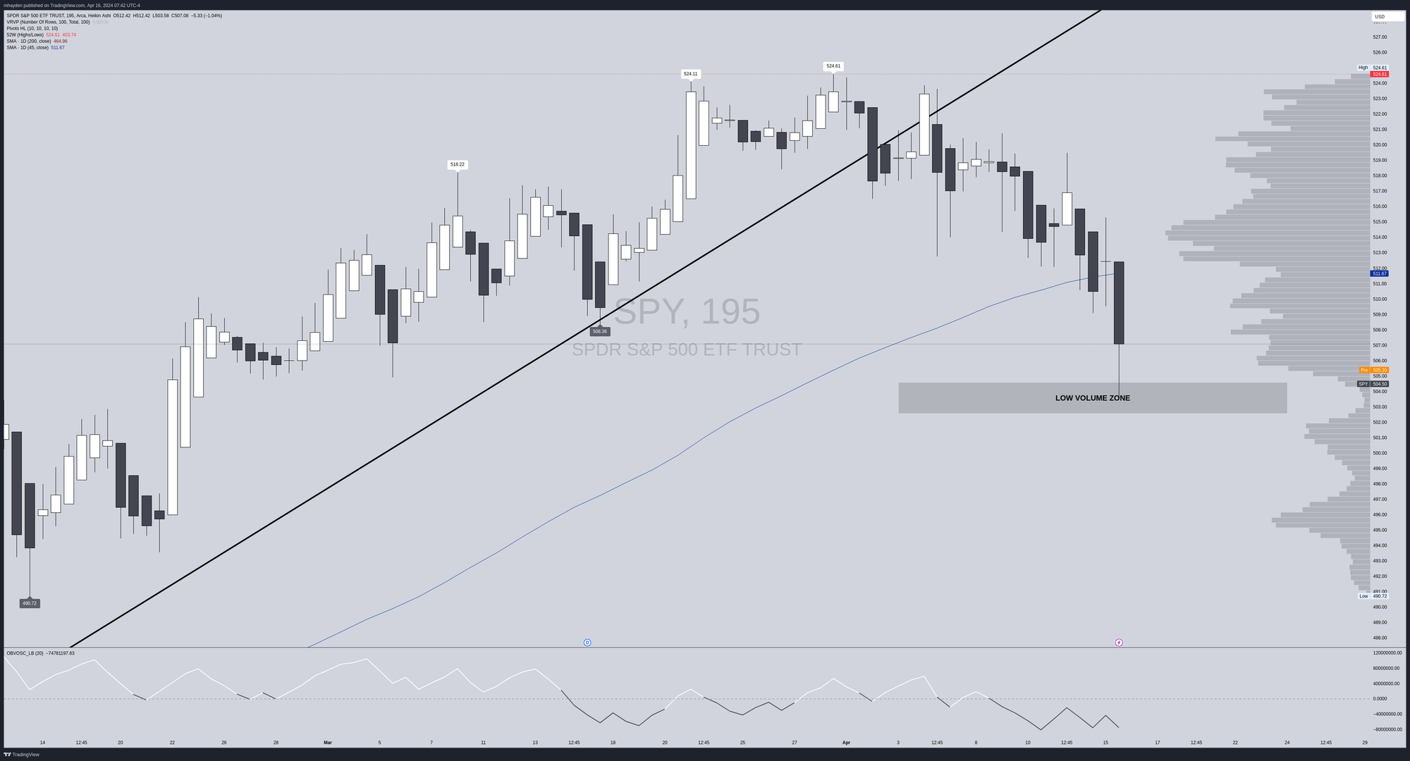
SPY landed in a low volume area left over from a gap (which you can't see, since I am using Heikin Ashi candles here to spot trends). It bounced decently out of that area yesterday and it's riding about $1 higher this morning before the market opens. We've broken the 45 day moving average and my most recent trend line.
Price generally doesn't want to hang out in low volume areas for long as there are fewer buyers and sellers there. Price tends to seek out higher volume levels.
The On Balance Volume oscillator hints that volume is confirming the current trend. We have declining candles with an OBV that is also making lower highs. However, the OBV is also failing to make lower lows. This suggests to me that there's some increasing buying pressure coming in at smaller levels.
Thesis
First off, I hope this post helps you find more data that you can use to examine the market at a high level. I went digging into lots of comparison charts, such as XLK/XLP, XLK/XLE, and SPY/RSP this morning. What sticks out to me is that this most recent move feels like a rotation into cash more than anything.
If the market was moving to a more risk-off scenario for a longer period, I'd expect to see more traders getting into defensive and energy stocks, but I'm not seeing that right now. Predicting the future is a fool's errand, but knowing where money has gone recently is a good measure of market trends.
I'm probably sitting with a bit too much long delta right now and I've made this mistake plenty of times before.
My current plan is to watch how SPY navigates this $502-$505 area. If it breaks below, my estimate is that we see some support around $480 (SPX 4800) and I'll begin reducing my exposure if we lose the level at the lower $500s.
If we bounce off this level and head back up, I'll feel more bullish when price passes above $512. That's a fairly low volume area with plenty of volume above from $515-$520. There's always a chance we could reject there and head lower, so I'll be open to that possibility.
Good luck to everyone out there today! 🍀
Discussion